British Gas
I worked with British Gas on a six-month project leading the redesign of their native mobile app for pay-as-you-go customers. This project began during the energy crisis, when many customers struggled to afford their energy and required support. British Gas sought to provide better support to its customers and reduce the cost of serving them.
I worked in a small team with a mix of stakeholders from SOMO (my agency) and the client side of British Gas. The team included a product owner and product manager from both sides, a strategist, and other senior stakeholders when needed.
The success of this project meant that:
- We have reduced the number of calls to the customer service team so British Gas can support its other customers faster.
- Balance alerts and automatic payments have meant fewer accidental disconnections, and customers no longer need to look at their meter or worry about topping up.
- Customers can access financial support to help them navigate the energy crisis.
DISCOVERY
How effective is the current experience?
I conducted a UX audit of the current app experience, looking for pain points, quick wins and areas which require exploration and testing.
- The app's home screen and navigation focus on upselling and advertising products and services rather than what a customer wants.
- Customers are taken out of the app and passed between the website and telephone to complete basic tasks. There needs to be more continuity in the journey and visual styles.
- Topping-up gas and electricity require the customer to complete two transactions, which is a significant inefficiency and a waste of the customer's time.
- It's hard for customers to see their top-up history and energy spend because payments are split by fuel type.
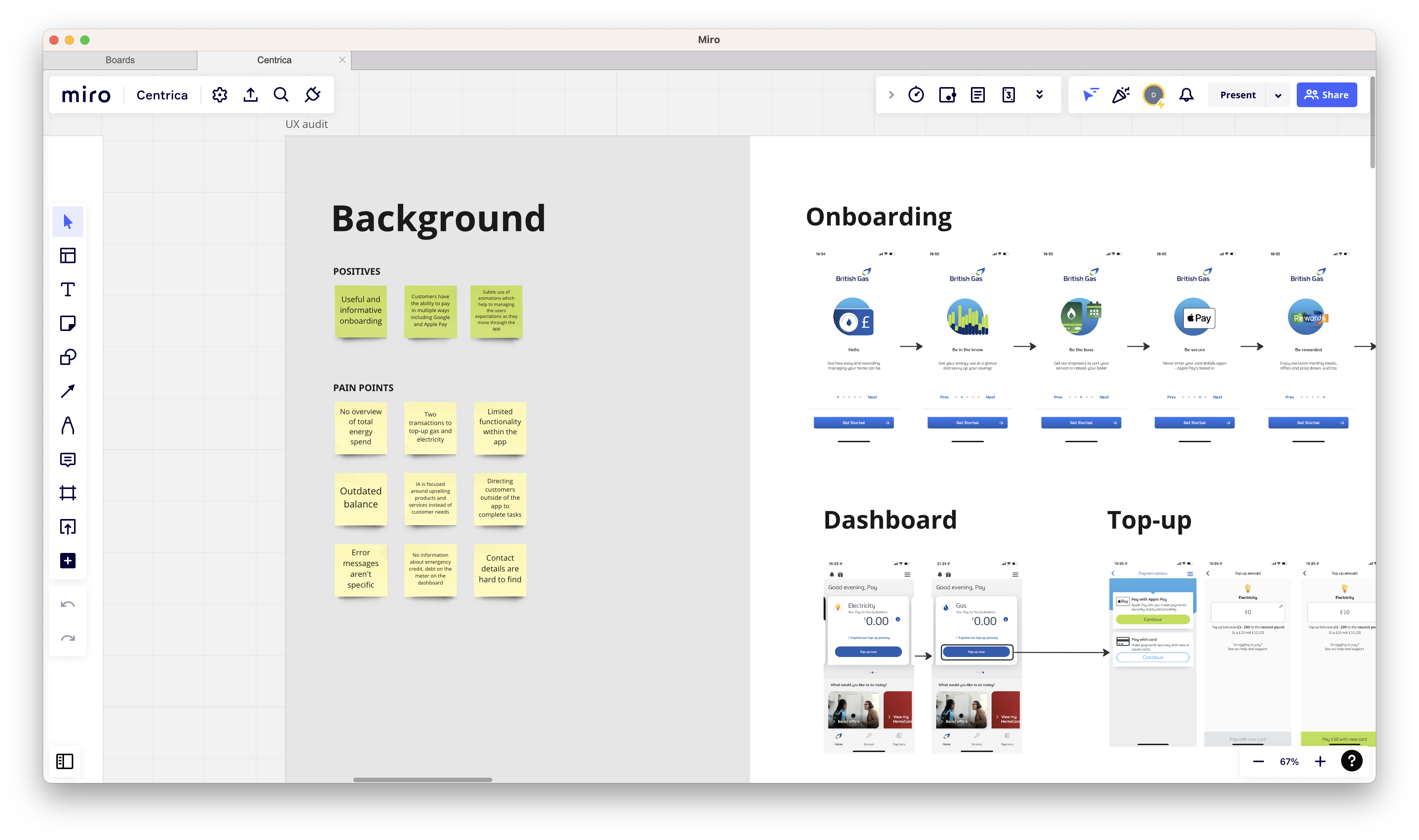
A screenshot of the UX audit.
DISCOVERY
Is the British Gas experience aligned with the other energy providers?
I conducted usability testing with participants from the other major energy providers to understand how their experience compares, identify uncovered needs, and hear how they felt about their energy company.
- Topping-up is simpler and easier on other apps, and customers can top-up both fuels in one transaction.
- Other energy providers are more up-front about the financial support they offer. Utilita, for example, promotes financial support through a 'power up' on their home screen, which allows customers to apply and access financial support without leaving their app.
- Other energy providers allow their customers to manage more of their accounts through the app. The apps are rich in features and information. However, some are bloated and hard to navigate.
- I learnt that many people aren't pay-as-you-go customers by choice and are constrained by their property or landlord and felt like their energy provider was punishing them through higher prices and limited trust.
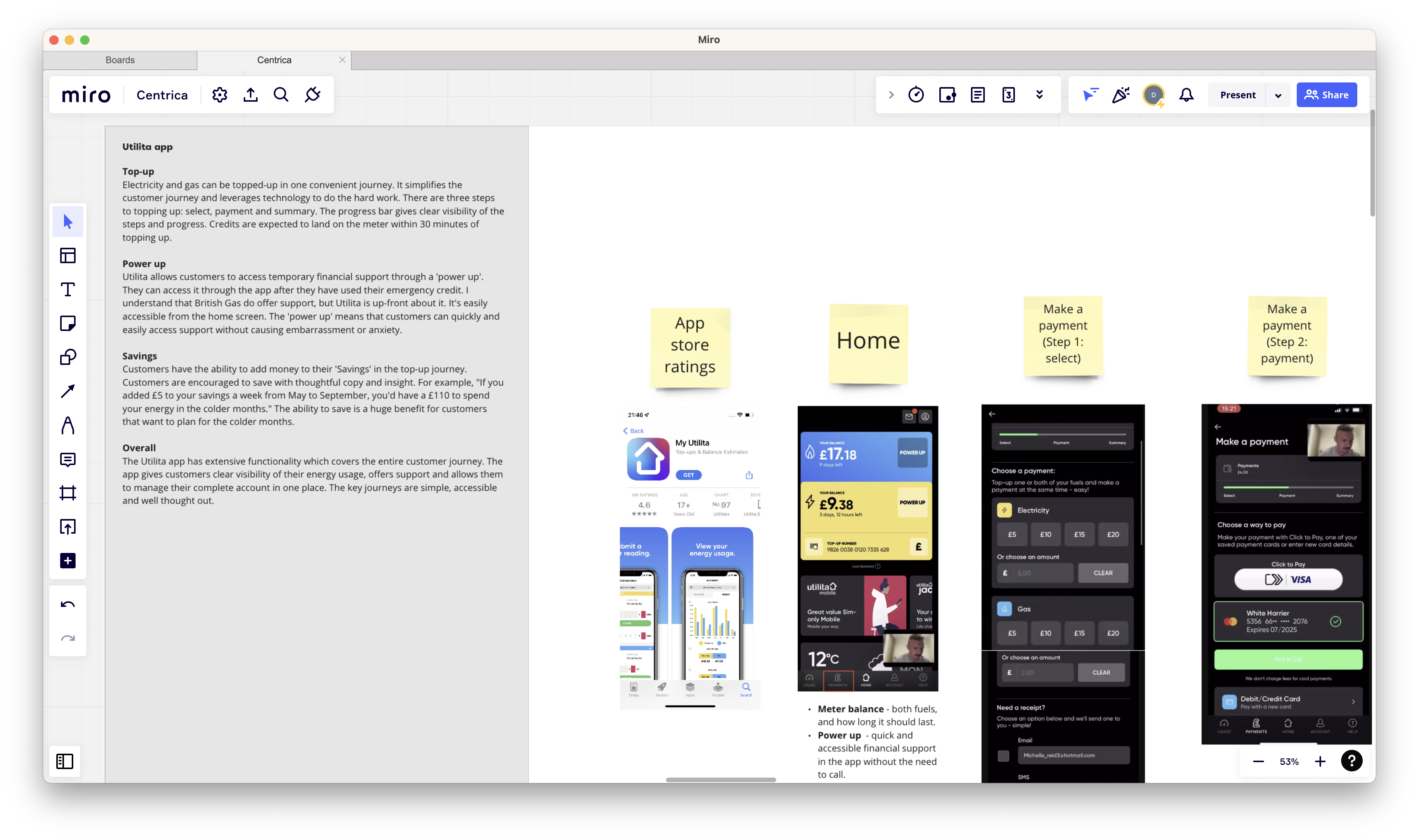
Usability testing analysis in MIRO.
IDEATE
Improving core journeys and creating new concepts
I created several prototypes to bring into usability testing. The prototypes were a mixture of new concepts and improved journeys and were informed by the previous research. Each prototype was an effort to reduce pain points and better support customers.
Problem 1
Customers would have their energy cut off because they were unaware their balance was low. Customers could be at work, on holiday, or away from their meter. The process to reconnect was slow, and customers were left without power.
Solution
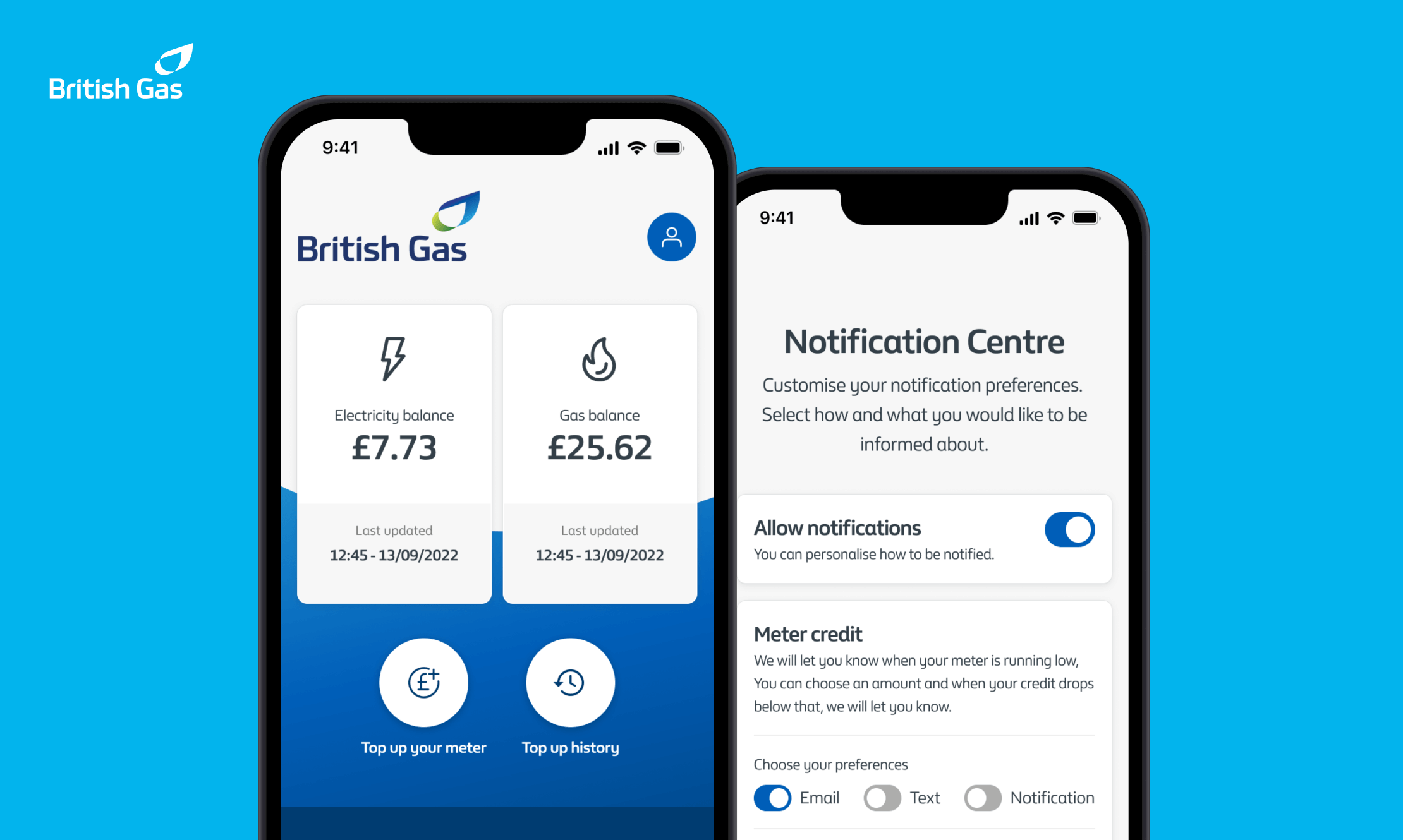
I designed a notifications centre which allows customers to set low-balance alerts. They would specify an amount, and when their balance dropped below that threshold, we would send them an SMS, email or push notification, whichever they prefer.
Problem 2
It was repetitive for customers to top up. They had to top up their gas and electricity individually. There was no way for a customer to see their total energy spent because each fuel had its own section.
Solution
I simplified the top-up journey into one, allowing the customers to top-up both fuels in one transaction. I re-designed the payment screen to show both fuels in one view, created filters to enable the user to customise their view and provided precise totals for each month and the year.
Problem 3
The demand for the call centre was high, and customers faced lengthy waits. This was impacting customer satisfaction and costing British Gas as they needed to bring in extra support.
Solution
I took the most common issues customers call in for and created self-serve journeys to allow customers to access support, order a replacement card, find top-up locations and an onboarding wizard to guide new customers.
Low-fidelity designs created in Figma.
PROTOTYPING AND TESTING
Testing our hypotheses and proposed improvements
I ran four rounds of usability testing during the project, and this was the second. The purpose was to test our proposed improvements and new concepts. I created the low-fidelity prototypes in Figma and tested them with existing pay-as-you-go customers. The testing helped me measure our hypotheses' effectiveness, identify areas of refinement, and determine what features could be de-prioritised.
Key insights
- Automatic top-ups simplify the management and payment for pay-as-you-go customers. Customers don't need to worry about losing power or needing to check the meter, saving them time and stress.
- Participants were not aware that British Gas offered financial support and would need to know where to look for it.
- The self-serve journeys, including ordering a replacement key and finding a top-up location were easy to use and preferred over the current process, which requires lengthy call times. Creating self-serve journeys will give customers better access to support when needed.
- Notifications were a valuable addition to the app experience. Participants used the notifications centre to set their preferences, which were very different. Giving customers the ability to choose their preferences will help drive engagement and ensure that important communications are received.
DEFINE
Financial support in the app?
The number of customers calling British Gas to access financial support has increased by over 50% in the last year and is likely to rise. Those customers face lengthy call waiting times and potentially embarrassing conversations.
I worked with British Gas to map out the current experience and determine whether designing this process in the mobile app would be possible.
Key insights
- Currently, the only way customers can access financial support from British Gas is over the phone, the call centre is only open between certain hours, and people can find calling and asking for support embarrassing or stressful.
- It can take a long time to get through to an advisor, with waiting times exceeding an hour. Customers we spoke to don't have that time to wait, so they borrow money from their relatives or friends.
- Some support mechanisms are in place that reduce the likelihood of customers' power being cut off outside of call centre hours. But these are limited and only at certain times.
The current journey of applying for financial support.
REFINE
Preparing for handover
My final work on this project was finishing the high-fidelity designs and building components into a design system, using elements of the current brand where possible. The design system covers everything from typography and button styles to accessibility standards. I worked closely with a UI designer and British Gas designers to build the design system. I ran regular check-ins and collaborative sessions to ensure the components were extensive, consistent and of the highest quality.
Some of the high-fidelity designs I created for the app.
OUTCOME
Supporting customers and reducing costs
Throughout this project, I worked closely with British Gas and its customers to improve core journeys and designed new features which keep the customer in control and on supply. Customers can now access financial support through the app without lengthy waits and difficult conversations. They can set up automatic payments, reducing the effort and stress of remembering to top up their energy.
Customers can get help when they need it most through the design of self-serve journeys. The improvements I have made to the app have improved the experience for customers, and they are empowered, supported and in control. The re-design has helped British Gas reduce its service cost and the demand for the call centre.
Other work
E-on NextMobile app
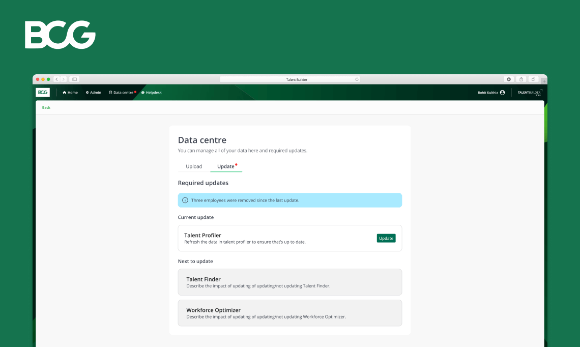
Talent BuilderSaaS
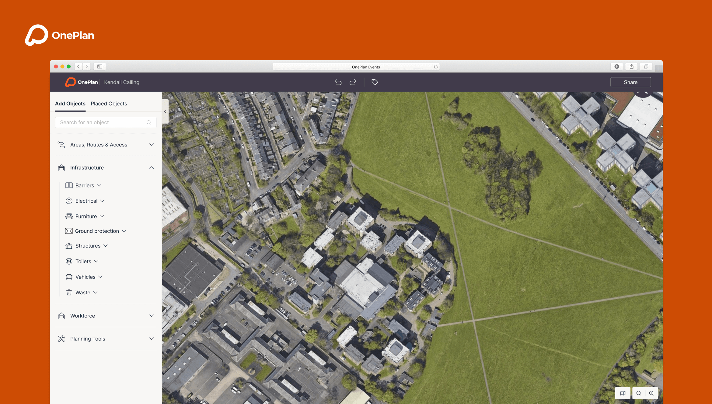
OnePlan EventsSaaS
OptumProduct design
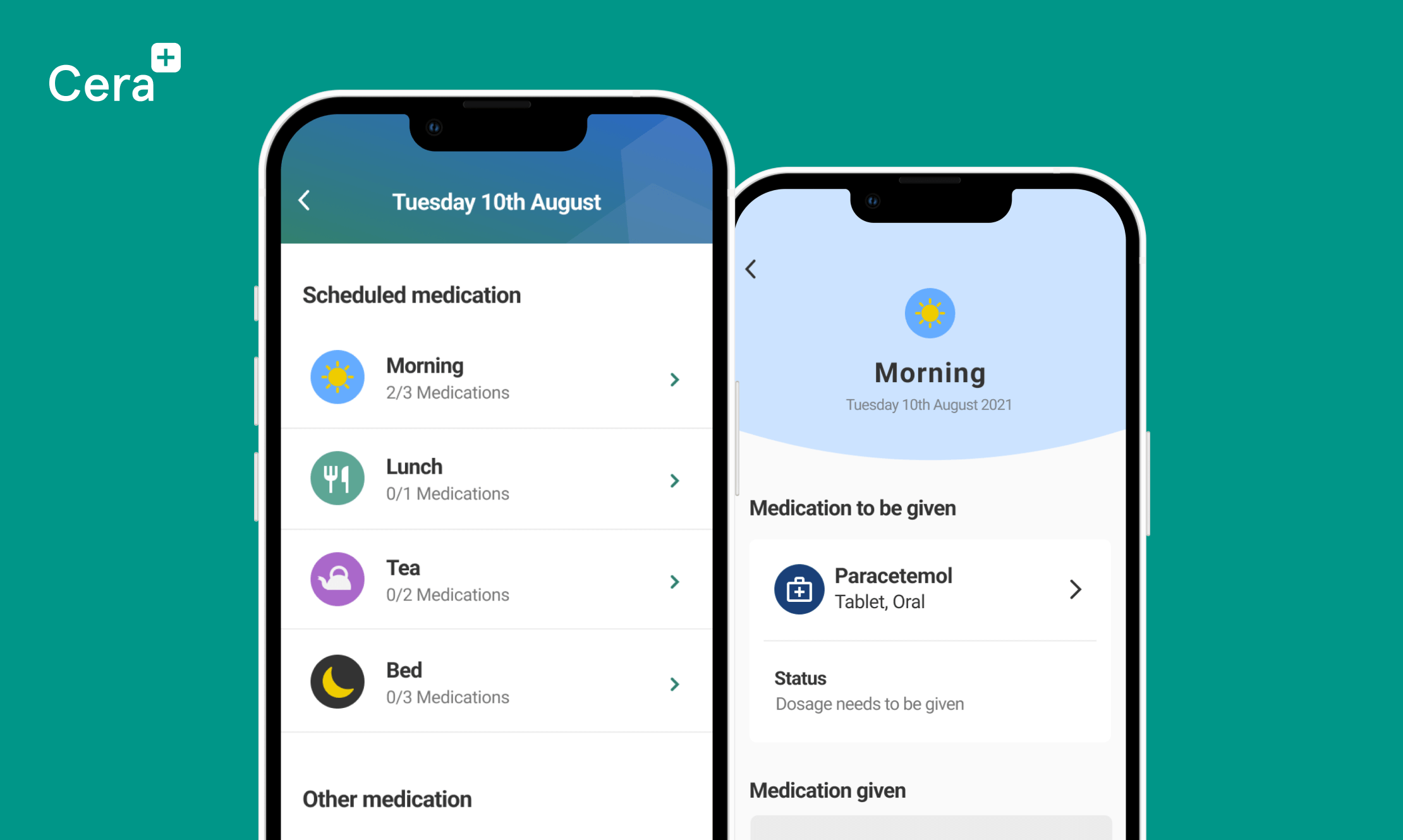
Cera CareMobile app
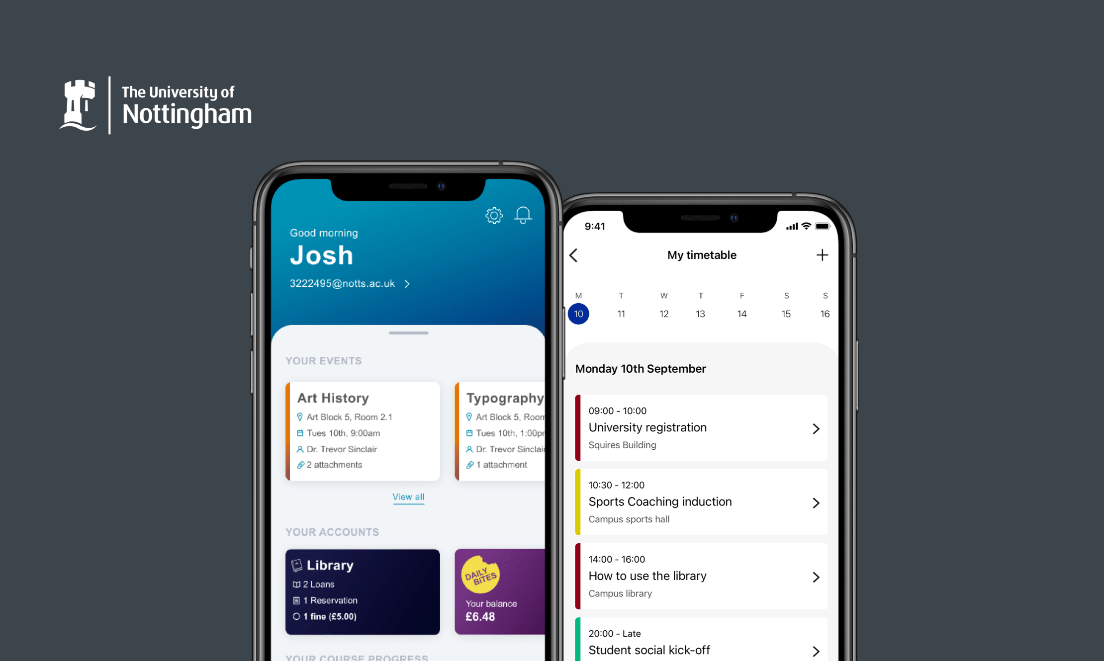
University of NottinghamMobile app