Cera Care
Cera is a start-up company revolutionising care at home through technology. I worked on the mobile app used by carers. During the project, we reduced admin time, increased accuracy in giving medication, and freed up carers, allowing them more time to engage with clients.
I was tasked with improving how the medication is administered, recorded and reported. Medicine was logged on paper, and reporting was slow and accidental overdoses often went unnoticed. These factors affect the level of care and could negatively impact a client's health. I was the UX lead on this project, working with a multi-disciplinary product team.
DISCOVERY
What are the issues with the current experience?
I organised conversations with key stakeholders, including branch managers, carers and the product team. The conversations helped me to understand the space, gather existing research and benchmark the current experience.
A previous designer had created some initial designs, but they weren't tested and only covered a small part of the journeys/scenarios. I made two prototypes in Figma, one using the initial designs and a hypothesis based on the insight I had gathered. I worked with a researcher to test the prototypes.
Key findings
- The current process for recording medication is paper-based. The forms have to be printed by branch staff and sent out to each client's home. Task analysis in one branch (89 clients) showed approximately 7.5 hours to update, print and send out records each week.
- The forms are collected once during the month, which takes each branch 14 hours (per month) to complete. The records aren't shared or reported with the branch for weeks. The lack of timely reporting can be dangerous and impact a client's health.
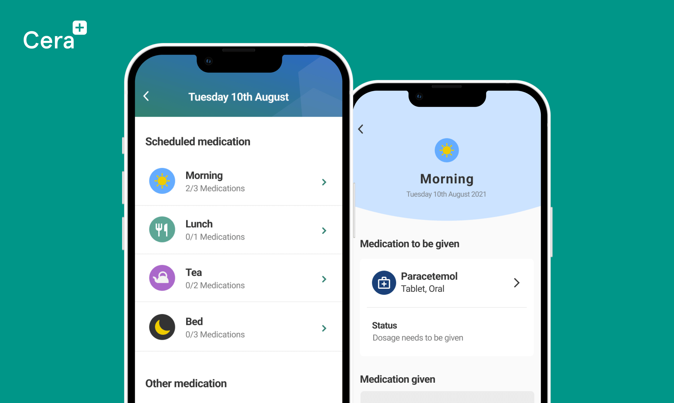
Figma designs for the existing and proposed medication list.
IDEATE
Could the paper-based system be replaced?
The prototyping and testing demonstrated that developing a medication feature in the app would dramatically improve the existing system. It was easier and more efficient than the paper-based alternative. However, further work would be needed to ensure that it could completely replace the current system.
Key findings
- There are many types and variants to medication, some of which require special consideration, such as patches, controlled drugs and anticoagulants.
- Some medications need to be given before, with or after food. If these types of medication aren't delivered correctly, it could be discomforting or dangerous for the client. Therefore, it's essential that the designs clearly show how the medication needs to be given.
- The information within the medication and dosage cards caused uncertainty and confusion. For example, it wasn't clear whether medication had or hadn't been given.
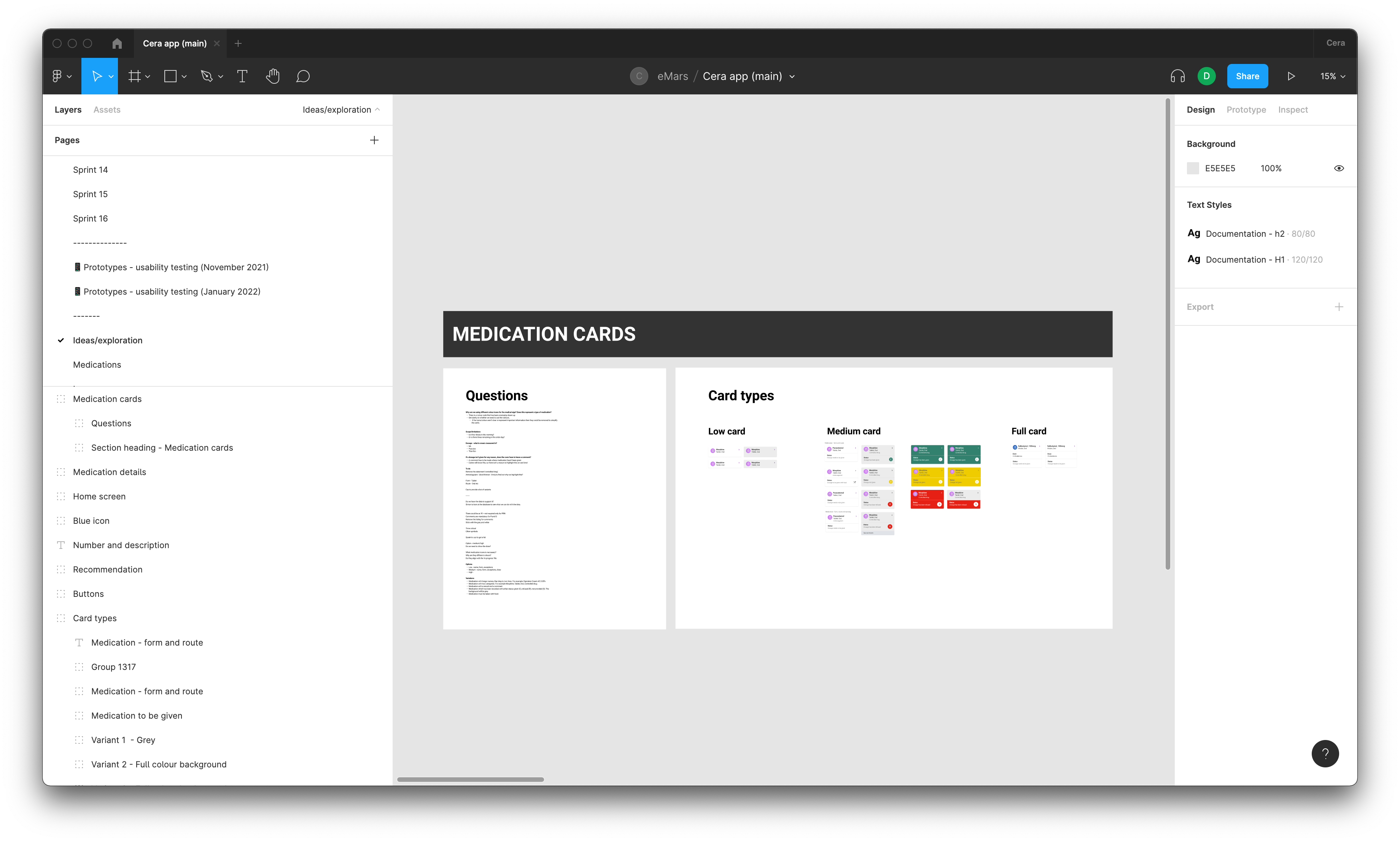
Ideas to improve the card designs.
DEFINE
Defining the scope, requirements and edge cases
Research showed that to replace the paper-based system further work was required. Working closely with the product owner, I documented the edge cases, scenarios, and requirements that have been missed or overlooked.
I then facilitated a workshop with key stakeholders to prioritise the requirements and edge cases. The outcome was a clear list of what I needed to design for and in what order.
PROTOTYPING AND TESTING
Piecing it all together
Informed by the research and a defined list of priorities, I created an extensive prototype. It covered a wide range of scenarios, medication types and edge cases that hadn't been previously considered.
I worked with the user researcher to plan the usability testing. The testing was split into two parts, an unmoderated study using lookback and a follow-up interview. I analysed the recorded sessions and co-facilitated the interviews. Overall the testing showed significant improvements were made from the initial designs and that our hypothesis was getting closer to replacing the paper-based system.
Key findings
- Participants didn't transition between scheduled and PRN medication sections easily.
- The codes associated with recording medication are different in other countries in the UK.
- Accessing comments from other carers was a long journey, and it wasn't immediately obvious where to find that information.
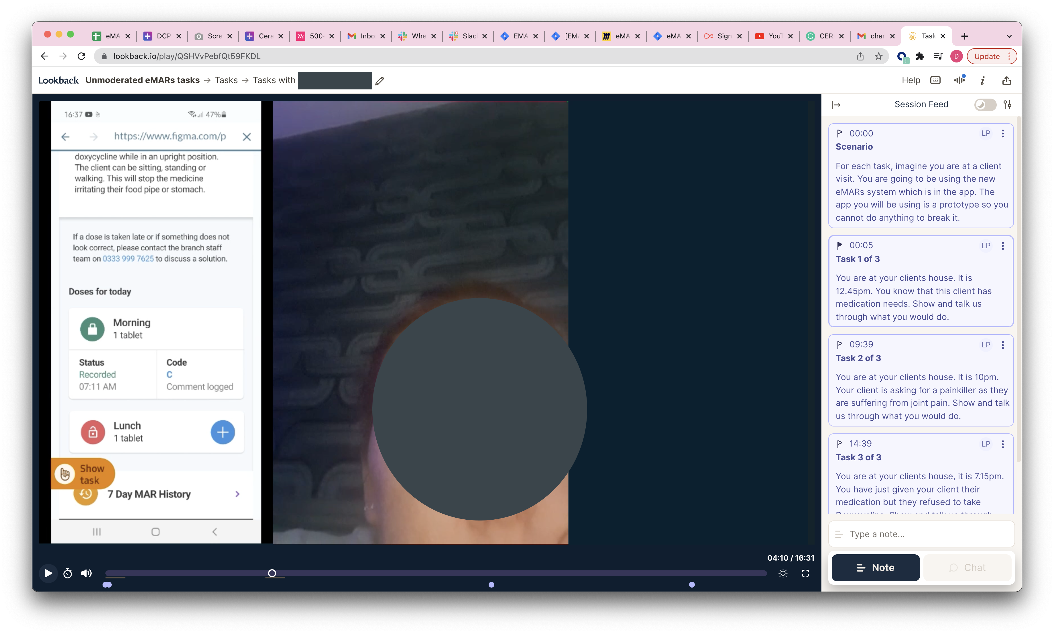
A screenshot of the unmoderated usability testing session.
REFINE AND DEVELOPMENT
Preparing to pilot
I used the insight from the testing to refine and improve the prototypes. Working with the product owner, we created a backlog of work in JIRA and prioritised and evaluated associated work with the product team.
During the development of the medication feature, I was constantly working closely with the developers to ensure that the app was designed as intended, it was accessible and that it performed. Any changes were documented and put into the backlog.
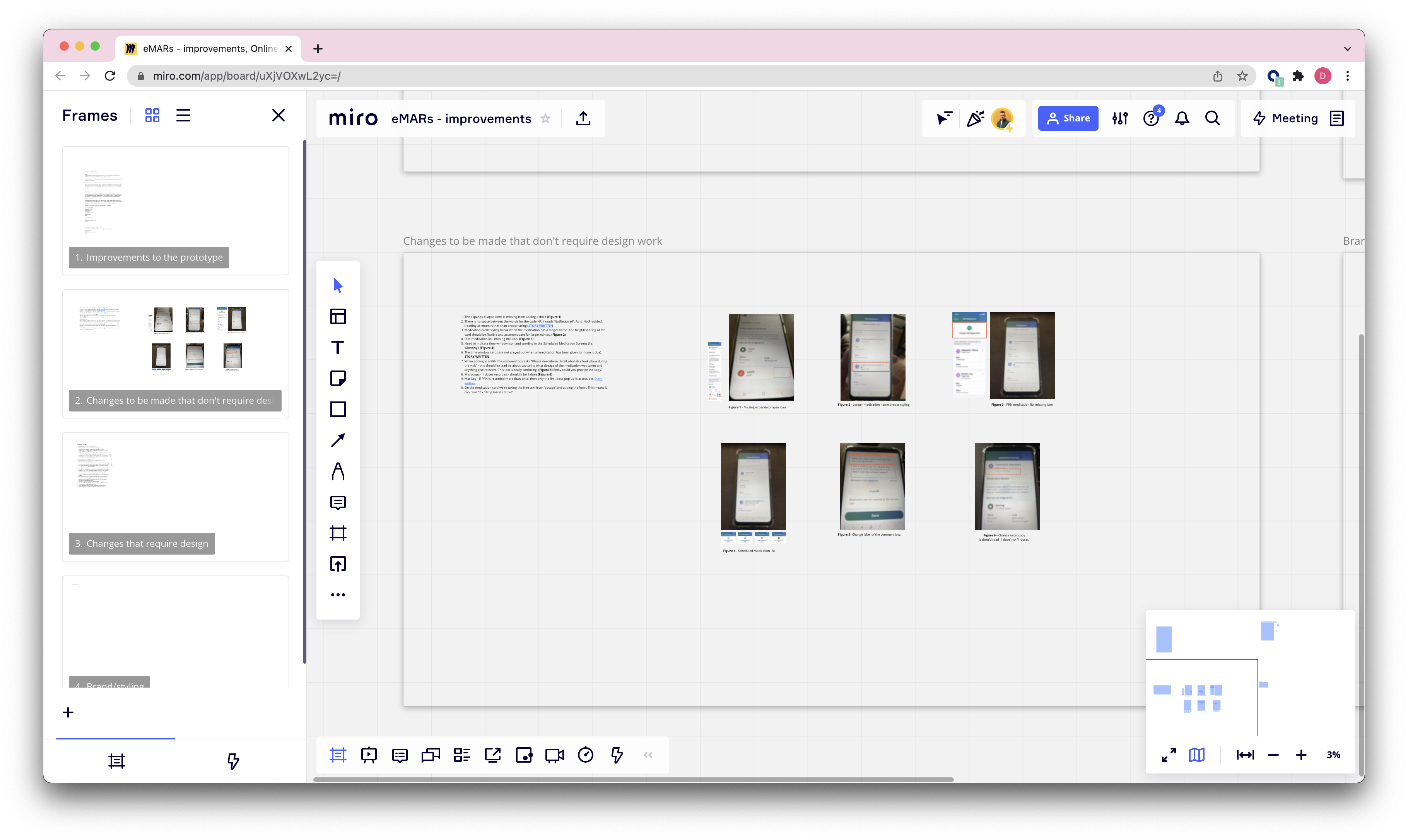
Some of the changes and feedback I had documented in MIRO.
OUTCOME
Rolling out the pilot
The pilot has been successfully running for a month, and it is being rolled out across more branches every week. Carers now have more time with their clients and spned less time on admin, medication is reported to the branch in real-time, problems are spotted earlier. The quality of care provided by Cera has drastically improved and contributed to their continued success and growth.
Other work
E-on NextMobile app
Talent BuilderSaaS
OnePlan EventsSaaS
OptumProduct design
British GasMobile app
University of NottinghamMobile app