Talent Builder - BCG
Boston Consulting Group (BCG) hired me to improve the usability of their workforce planning software, Talent Builder. The software helps companies plan their future workforce, model scenarios, and understand what skills and roles they will need. The software was in the beta phase, and early feedback showed that users could not set up and use it without support from a consultant.
The outcome of the project:
- A detailed UX audit
- A prioritised backlog of changes
- Two interactive prototypes
- High-fidelity designs
DISCOVERY
Getting started isn’t easy
The setup is complex and repetitive. Users are required to download, fill out and re-upload Excel spreadsheets into several areas. The setup has a sequence; however, this needs to be more obvious as there is no walkthrough.
The current design uses only some of the available space. Some pages only use 60% of the page width, so users have to scroll despite there being enough space to fit the information.
Menus hide functionality, which could be overlooked and make the design harder to use.
The design doesn't adhere to basic usability principles; it has low colour contrast, uses small fonts, has little spacing and lacks consistency.
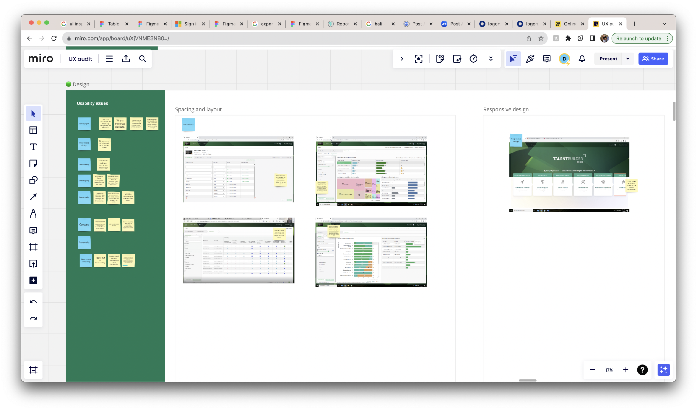
UX audit.
DISCOVERY
Unusable without support
I conducted usability testing with ten users involved in the Beta phase. The users came from a range of companies differing in size and sector. Some clear themes emerged from the analysis:
- Participants needed help to set up the software independently despite using guides in the help section.
- Updating data was fragmented across several sections, leading to a slow and complex process. It wasn't clear to participants where a data update was required, which could lead to inaccurate insights.
- Participants took screenshots of the data visualisations because they felt it was more straightforward and faster than using the export feature.
- An overwhelming number of visualisations and low colour contrast made it hard for the users to digest and extract findings.
- Participants found the number of visualisations overwhelming. Coupled with low colour contrast, it made the data difficult to understand.
- The terminology and language used in Talent Builder were complicated for participants to understand. Only participants working in HR seemed to understand it.
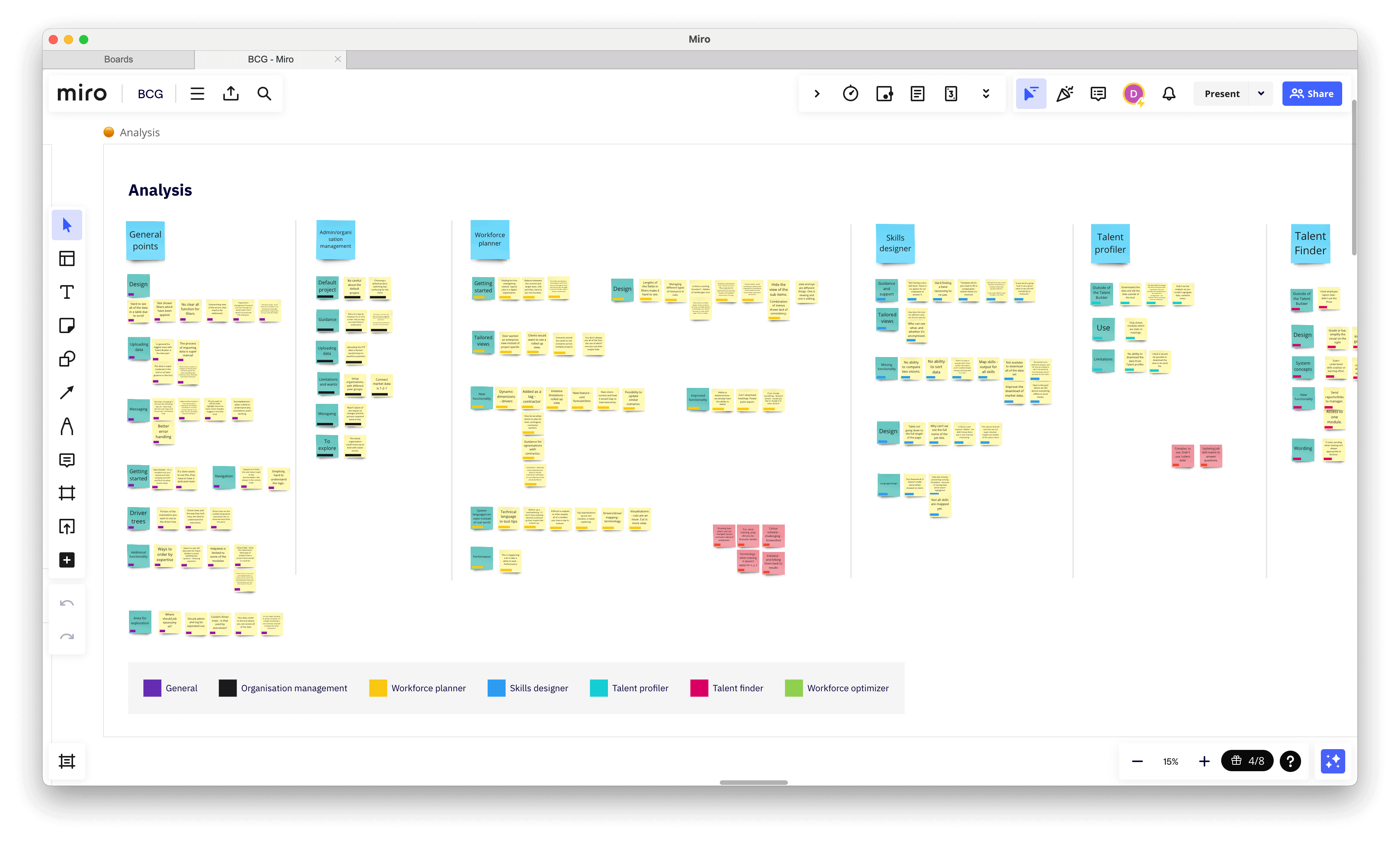
Usability testing analysis.
DISCOVERY
Are BCG missing an opportunity?
Several workforce planning software companies exist in the market, such as Gloat, Sky Hive, and Paddle HR. I conducted some competitor analysis using our software's problematic areas. I wanted to find out how they're handled, what functionality other software provides, and whether it is a better experience.
The most interesting insight was that competitors provided much more than analysis and modelling. Competitors take the analysis and help the organisations further in this journey by creating actionable insights, allowing employees to create profiles, apply for jobs, and detail their motivations and willingness to change. BCG are missing an opportunity to better serve and support their users through the entire process.
Competitor analysis documented in MIRO.
DEFINE
What can we do within the existing information architecture?
I worked collaboratively with the business analysts to map flows and information architecture. There was no previous documentation. My work showed stakeholders the complexity of the software, its scale, and how functionality is disconnected across the experience.
Information architecture mapped in Figma.
DEFINE
Planning ahead
I recommended many changes for BCG to implement, but given the time and budget restrictions, only some were in scope. I worked closely with the product owner and manager to create a prioritised backlog of changes they could work through when they had the time and budget.
A selection of changes from the backlog.
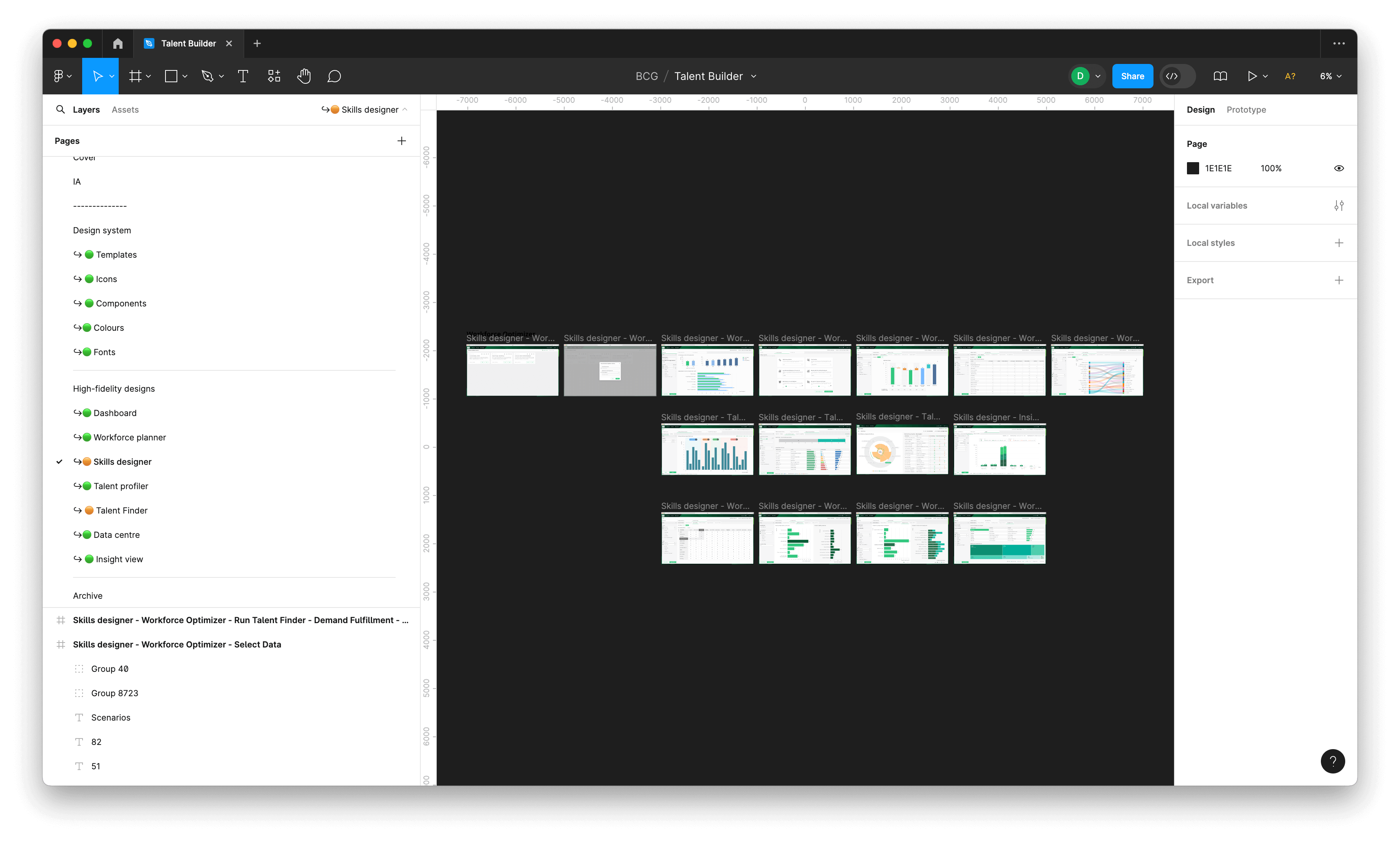
PROTOTYPING
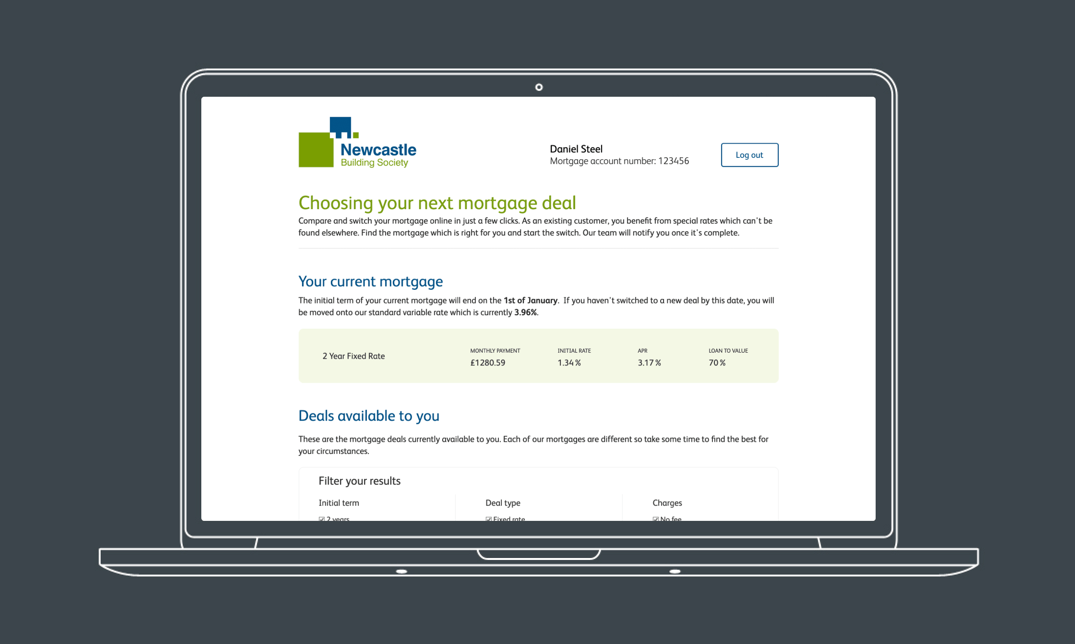
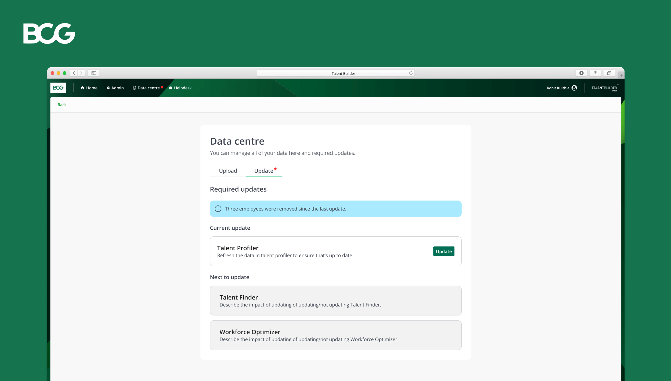
Improving key journeys
The discovery phase showed that users had the most difficulty setting up and refreshing data in Talent Builder. I created two high-fidelity concepts in Figma to improve these key journeys.
I went through a number of iterations while creating the prototypes and had to pivot to a different solution for refreshing data due to technical limitations. I worked closely with the developers to design an alternative that worked within the current tech stack.
Data centre - high-fidelity prototype.
DESIGN
Implementing change
There had been no previous design work on this project, so I had to start from the ground up. I used the current design language as a base, defining styles, creating components, writing documentation, and developing a new design system. The design system allowed me to design consistently, which needed to be improved in the current experience.
Some of the high-fidelity designs for Talent Builder.
OUTCOME
Improved usability and a foundation to build upon
Despite my limited time on the project and constrained budgets, I designed and implemented essential improvements to Talent Builder's usability. Through my work, I effectively demonstrated to stakeholders the value and importance of a user-centred process and design. This led to BCG having a clear roadmap and a prioritised backlog of future improvements based on user research.
Other work
E-on NextMobile app
OnePlan EventsSaaS
OptumProduct design
British GasMobile app
Cera CareMobile app
University of NottinghamMobile app