Collinson
Collinson is the leading provider of Airport lounges, offering customers access to lounges in over 135 countries. They hired 383, a digital consultancy I worked for, on a contract basis, to create their new design system. The project's purpose was to ensure compliance with the European Accessibility Act (EAA), coming into effect in June 2025. Collinson had recently appointed a new head of design and was hiring a new team to manage and use the design system, bringing their design capability in-house.
Working alongside a principal designer, we were responsible for creating a new design system that was accessible, scalable, and easy to manage. The new design system will be applied to Collinsons' digital products across the web and in the app.
DISCOVERY
Audit
I carried out an audit of the existing design system and digital products. The purpose was to understand the problem space, how effective the design system was, what issues and limitations designers faced while using it, and whether there were opportunities to simplify or reduce unused components.
Findings
- Critical states were missing from some components, including buttons and forms. These are essential for meeting accessibility requirements.
- The structure of some components was dense and complex, making it difficult for the designers to change states and ensure their designs' responsiveness. There is an opportunity to refine those components to ensure they are lean and surface-nested instances to ease use and control.
- Variables had been applied to some aspects of the designs but were limited and used inconsistently. Using variables will help with scalability and application to brand products.
- I identified unused components we won't include in the new design system, saving us time and allowing us to focus on the crucial elements. There is an opportunity to combine some components to keep the design system lean and easier to manage.
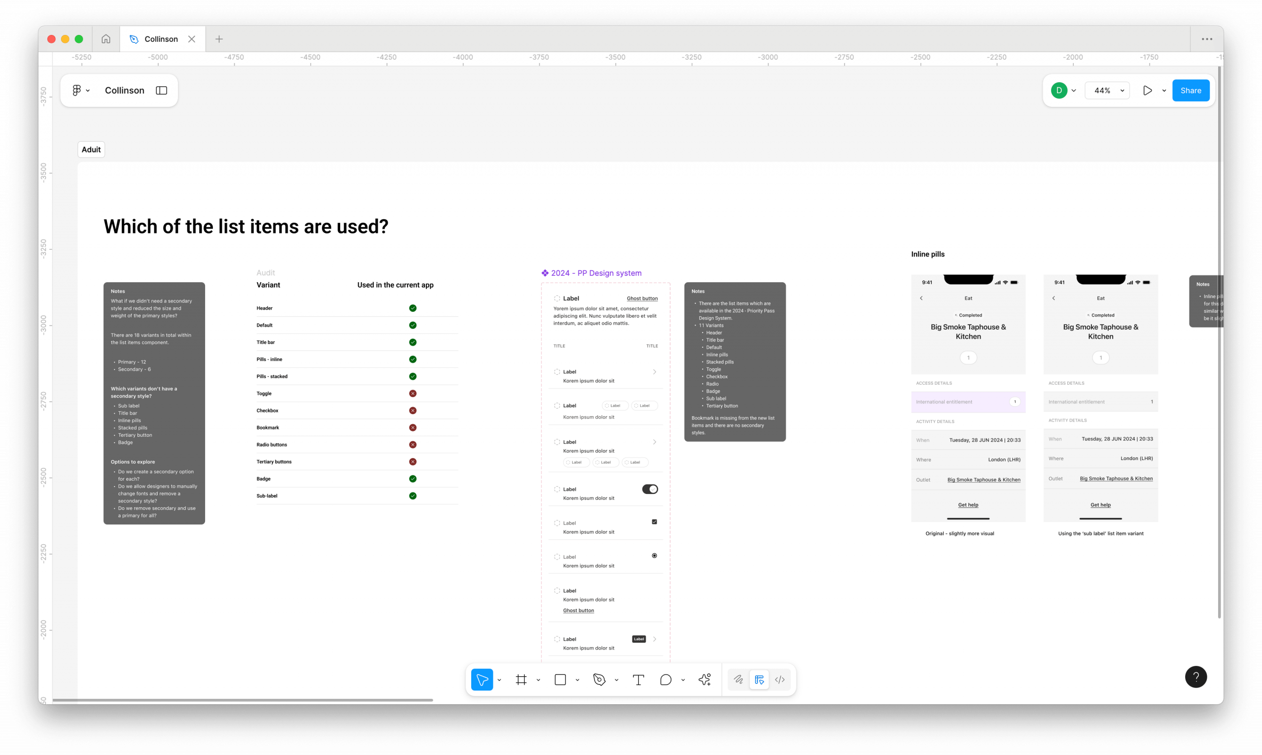
A screenshot from the Audit.
DEFINE
What components are needed?
Based on the audit, we created a list of the components needed for the new design system. Together with the head of design and internal designers, we prioritised each component; this gave us a clear roadmap and order in which to tackle the design work.
The list was added to a Google Sheet, and we updated it when a component was in progress, ready for review or completed. The client had access to the list and could see our progress throughout the design phase. We held daily stand-ups and weekly reviews with the internal team to provide updates and give them an opportunity for feedback. Regular collaboration and visibility of progress helped to build trust with the client.
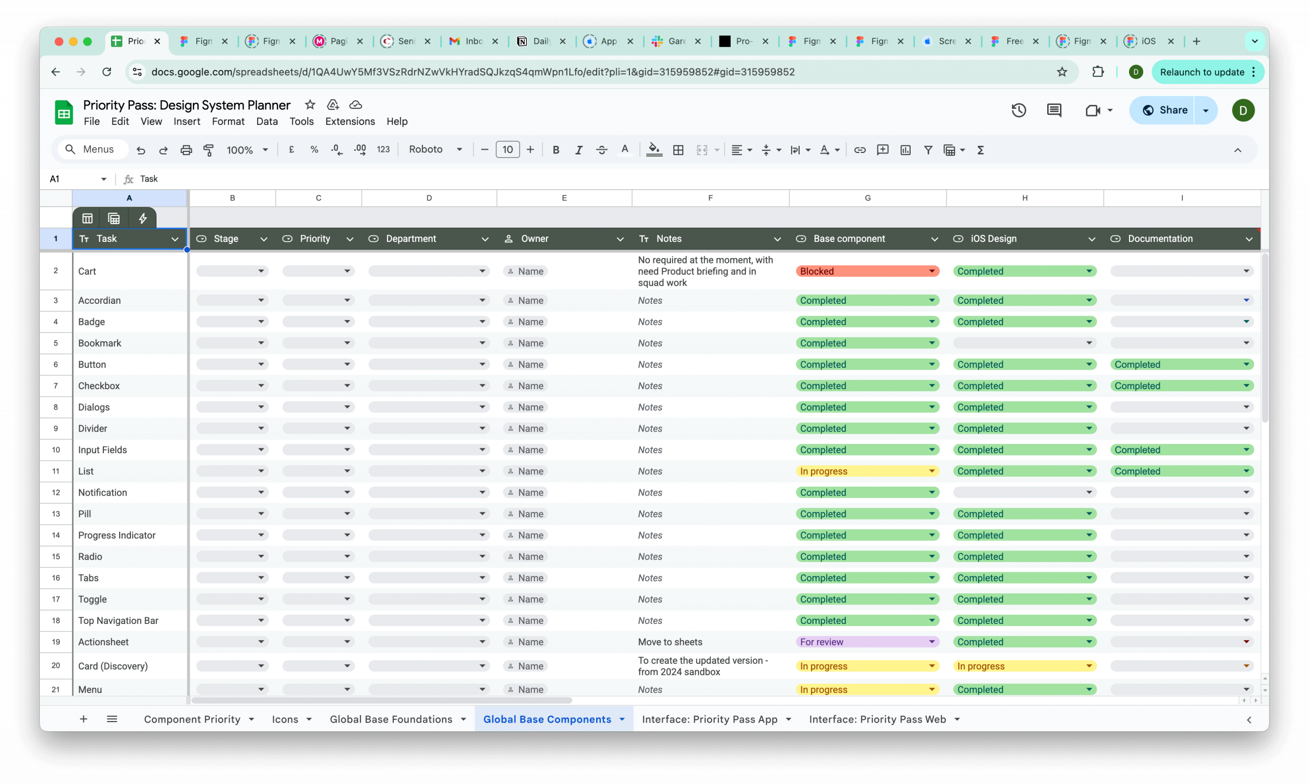
A sample from the list of priorities for the new design system.
DESIGN
Patterns over components
Sheets are one of the most used components in the mobile app; in the old design system, seven variants covered a wide range of use cases, from date pickers to filtering. We found that designers would still detach the component because they couldn't achieve what they needed. We overcame this issue by re-thinking the 'sheet' as a pattern instead of a component, creating component slots that do the heavy lifting and allow the designers to change them as needed. We also used this approach for other components; componentising patterns allowed us to give the designers flexibility without losing control.
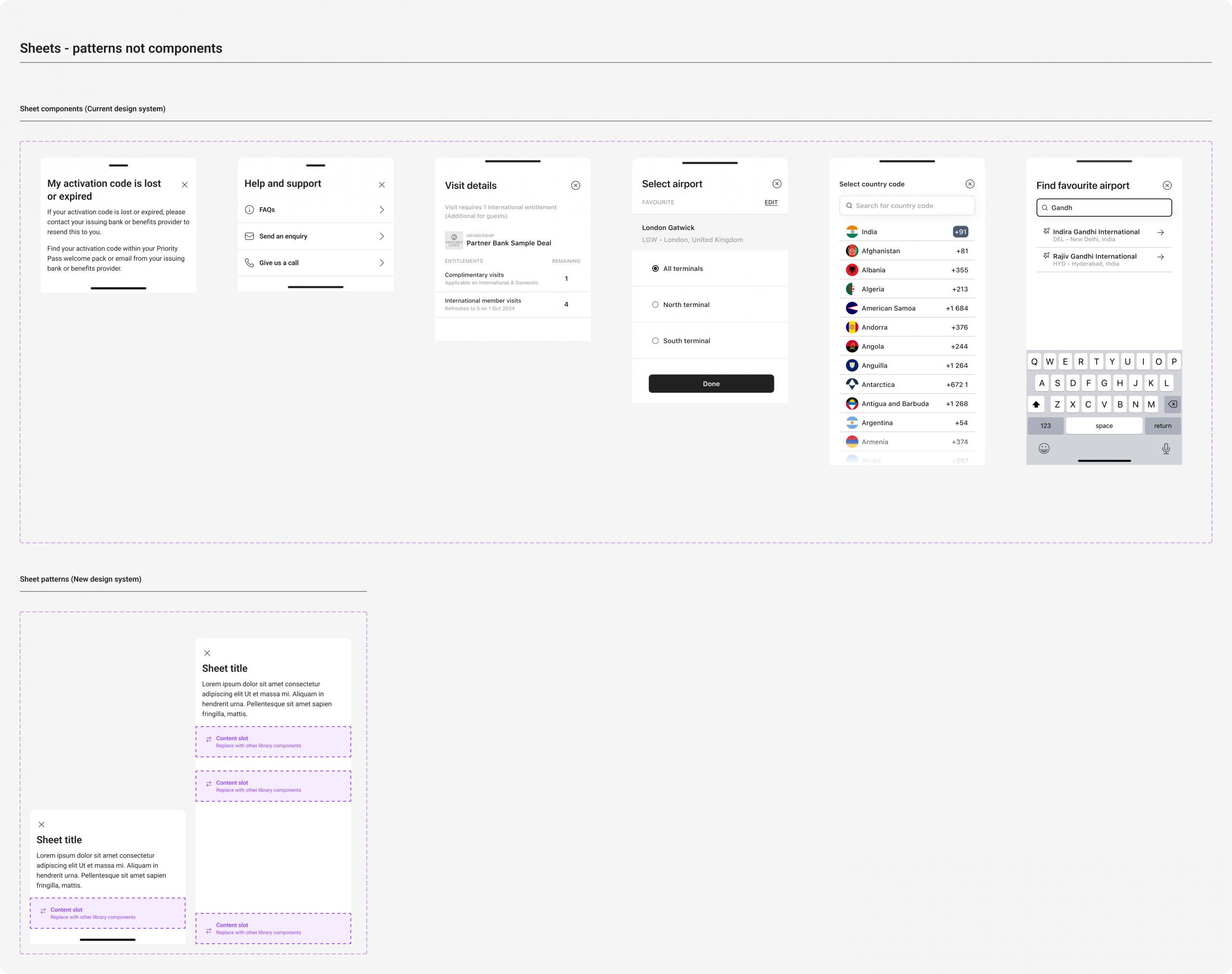
Using content blocks and patterns to create powerful components.
HANDOVER
Documentation
Accessibility was the main driver for this project, so I baked this into the documentation so that designers could refer to it when needed. The intention was to keep the designer in context and save them time finding guidance elsewhere. We included do's and don'ts to explain how each component should be used.
In our weekly reviews, we would check the documentation to ensure the information was clear and made sense to the designers. These sessions allowed us to share knowledge and discuss best practices; it was collaborative, and we could all learn.
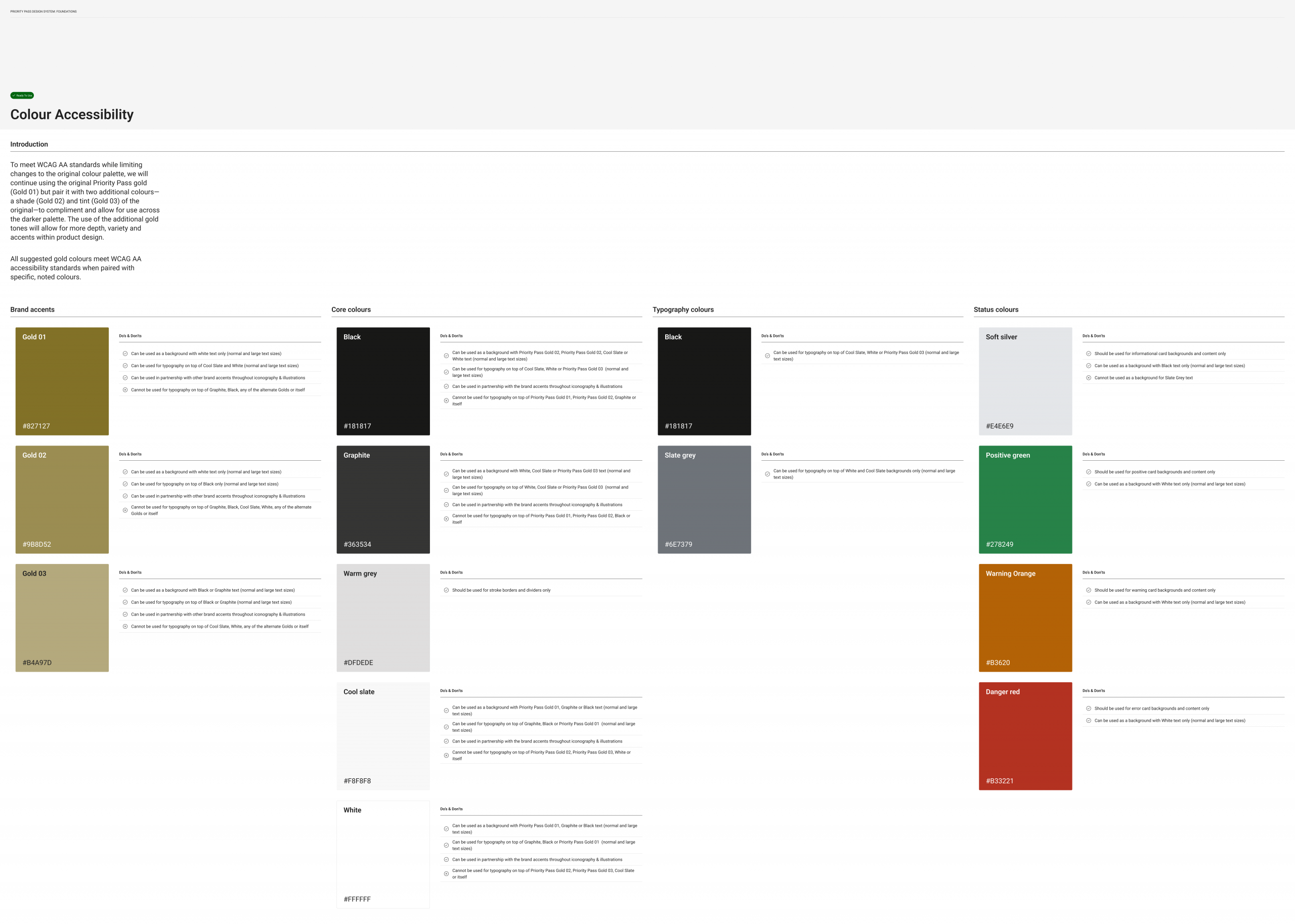
A sample of the documentation we wrote.
OUTCOME
Accessible, flexible and lean
The new design system is accessible, easy to use, and allows designers to build consistently at pace and scale. Designers can quickly apply a new brand to their designs; the time saving will be huge, and repetitive design work when it comes to white labelling their products.
While the design system's visual styles didn't drastically change, the components are easier to use, powerful, and lean, saving the designers time and effort. We were able to re-structure complex components into patterns, creating flexibility for our Collinsons designers and avoiding bloated components, which are hard to maintain.
Other work
E-on NextMobile app
Talent BuilderSaaS
OnePlan EventsSaaS
OptumProduct design
British GasMobile app
Cera CareMobile app
University of NottinghamMobile app