E-on Next
E-on Next is a sister company of E-On, one of the largest energy providers in the UK. The E-on Next band was created to be customer-centric and bring personality to the energy market.
The primary touchpoint for E-on next customers is the website; there is no mobile app. The purpose of this project was to deliver a new native mobile app that would give customers greater visibility and control over their energy usage. I was the UX lead on this project.
DISCOVERY
Broadening the proof of concept
Before the project started, a proof of concept was created by another designer at Somo. That proof of concept was used to secure the funding for this project. The proof of concept consisted of low-fidelity wireframes focused around one customer type.
Before I started to get into the design, I took the proof of concept and worked with the product owner and UX designer from E-on next to understand the priorities, requirements, and customer types.
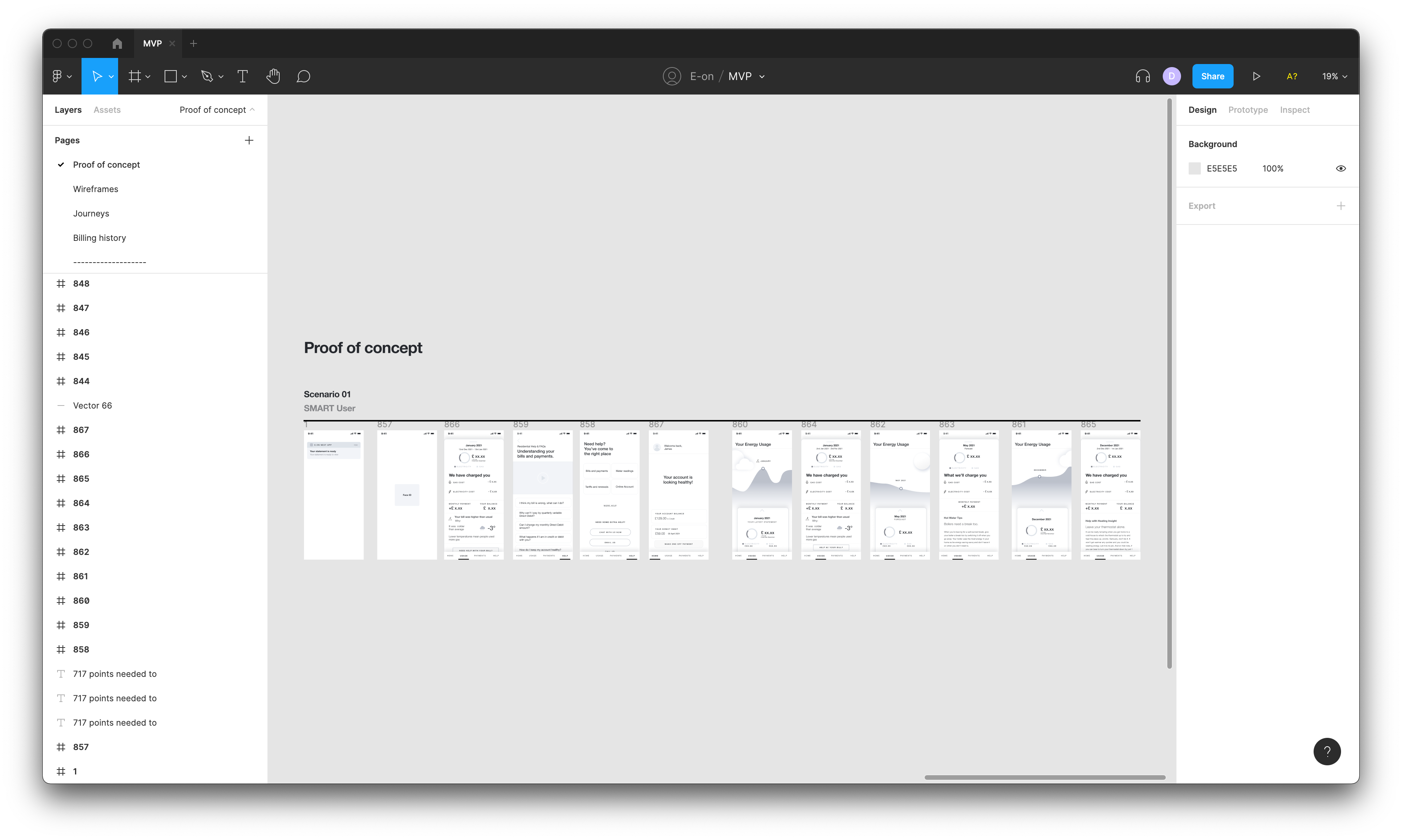
The proof of concept which I inherited.
IDEATE
Building key journeys
From the initial discovery work, I understood the different customer types, what features they need, and the priorities for the business.
I used Figma to build out the low-fidelity designs for each key journey and feature. The designs would form our hypothesis that I could test with customers. The key journeys included viewing energy usage, making a payment, submitting a meter read, finding help and accessing statements.
Low-fidelity wireframes of a migrated customer journey.
PROTOTYPING AND TESTING
Testing our hypothesis
I presented the wireframes back to the business, and overall they were extremely happy with the progress and how we were meeting customer needs and business requirements. However, I highlighted some areas that I wanted to test and understand from a customer's perspective. So, I refined the wireframes and developed them into two prototypes. One for each customer type (smart/traditional meter).
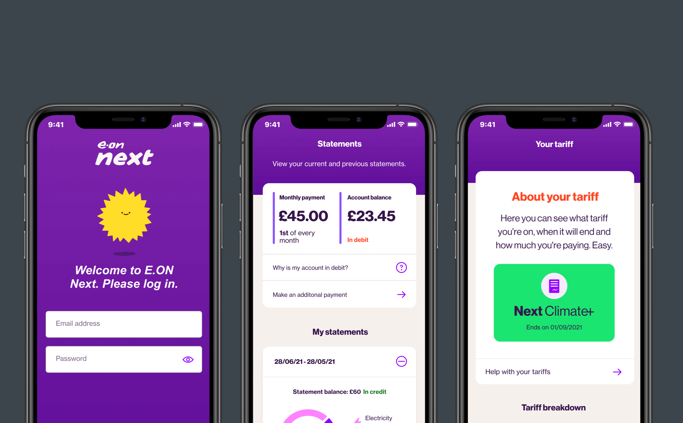
I planned and conducted a usability study to test the prototypes with E-on next customers. I tested with twelve participants over two days. The purpose of the testing was to understand how a customer would interact with the flows, information and functionality.
- Overall the prototype was easy to use. Out of 72 tasks, there were 6 occasions where participants did not complete the task.
- I observed that some participants weren't engaging with the energy usage screen, this meant that they struggled to find the information required in the task.
- Participants wanted to know more about their tariffs. This is interesting because that wasn't initially to be included in the MLP.
- A small percentage of participants didn't scroll on the home screen and missed important information. This could be related to it being a prototype and not a native app, but I need to ensure that the design encourages customers to scroll.
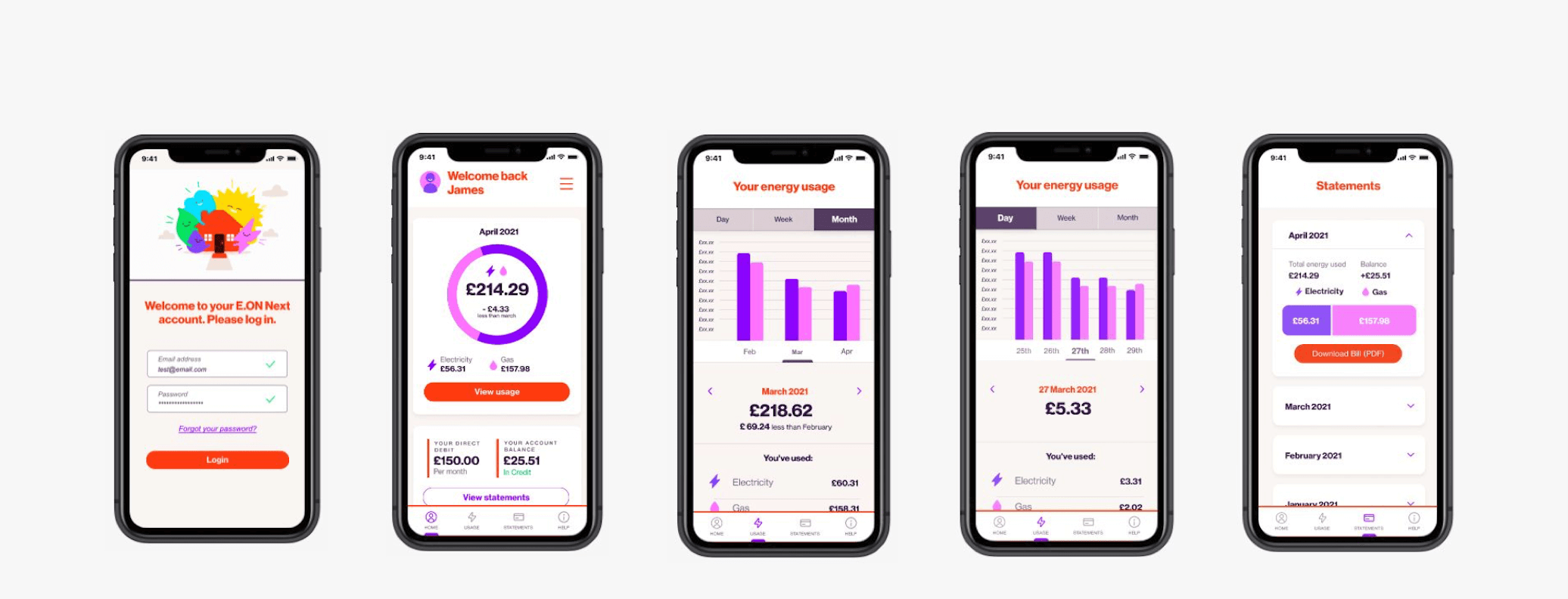
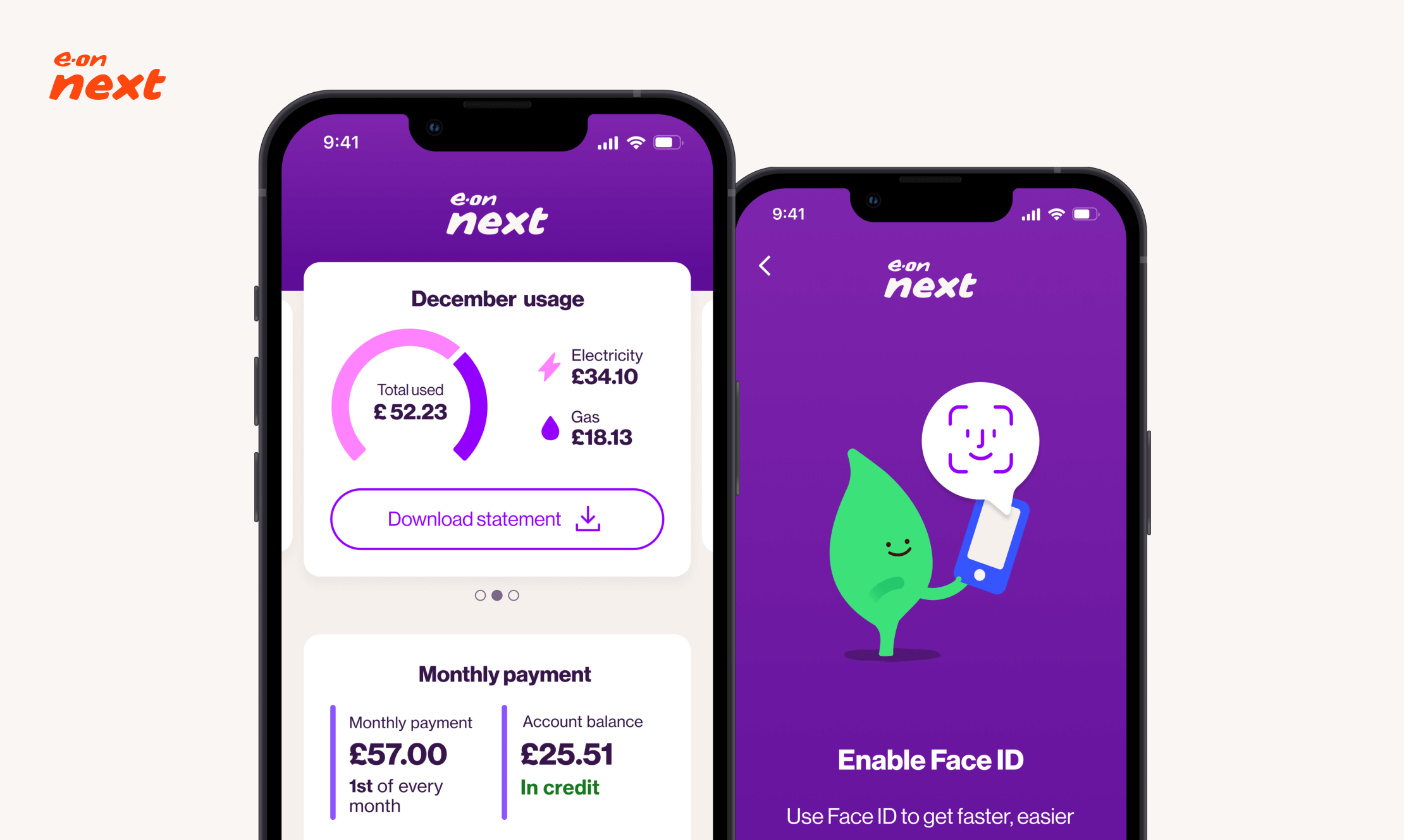
Some of the screens included in the prototype.
DEFINE
Uncertainty and change
As the project progressed, there had been some changes to the E-on team - new stakeholders started to be involved and suggested changes to the scope. There was also uncertainty about what features would be included within the MLP due to tight deadlines and new stakeholder involvement.
I facilitated a meeting with all of the stakeholders to define the scope of the app. After the meeting, I created a sitemap that helped us align and have a shared understanding of what will be built.
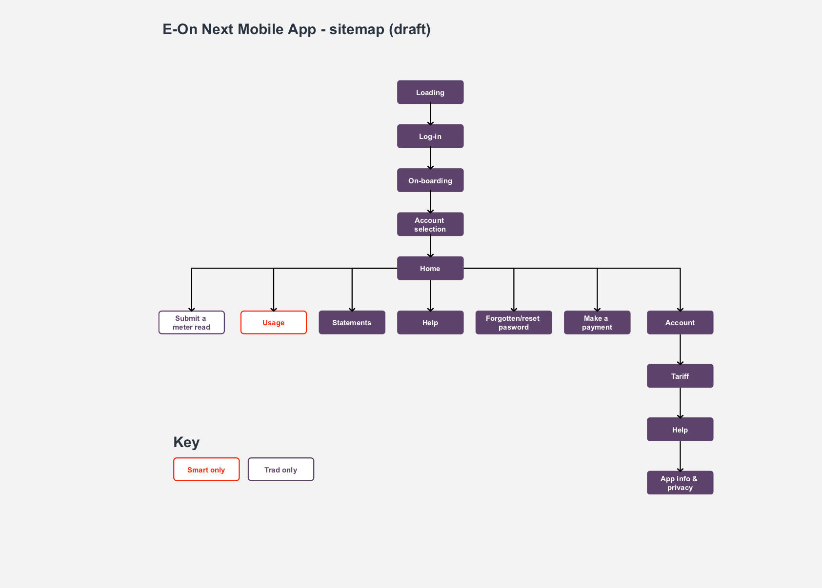
MLP sitemap.
IDEATE
Creating engaging data visualisations
After presenting the usability study findings to the client, we agreed to explore how energy usage could be better displayed. This was a high priority for the business and its customers. I took a deeper dive into data visualisations; I looked inside and outside the sector for inspiration and best practices. Based on the insights I found, I started to create some designs.
Key themes
- Flexibility - allow the user to choose a view they prefer through controls.
- Clarity - headings, keys, and hover states help to provide clarity.
- Adaptability - data visualisations must work when displaying small and large amounts of data and different fuel types.
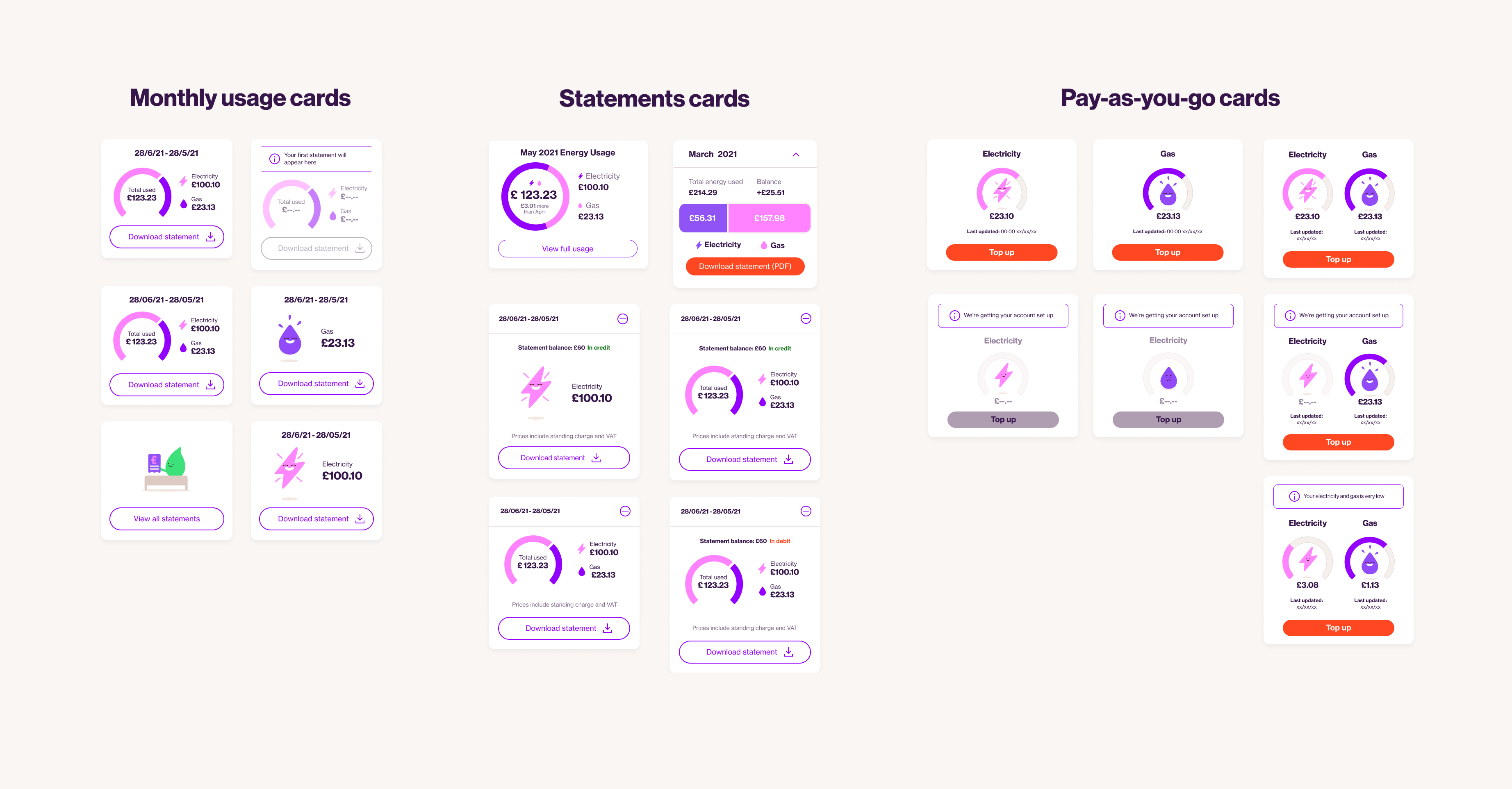
Some examples of visualising energy usage.
PROTOTYPING AND TESTING
How do customers want to see their energy usage?
From the ideation, I worked closely with E-on to create three concepts for displaying energy usage that I then built into prototypes to be tested. Each prototype varied in style, functionality and the level of information they showed.
Although this extra work wasn't included in the timeline or budget, I wanted to ensure that customers could easily access the information they needed and reassure the client. I secured the funding for the extra work and worked quickly to prevent delays to the project. In two weeks, I had created the prototypes and ran the usability testing.
Key findings
- The testing showed that an overview of energy usage was enough for most participants; they didn't need a daily breakdown.
- The majority of participants used the toggles to change the view. They said it was flexible and gave them a better understanding of their energy usage.
- Participants wanted to view previous months from the home screen without clicking on the usage screen.
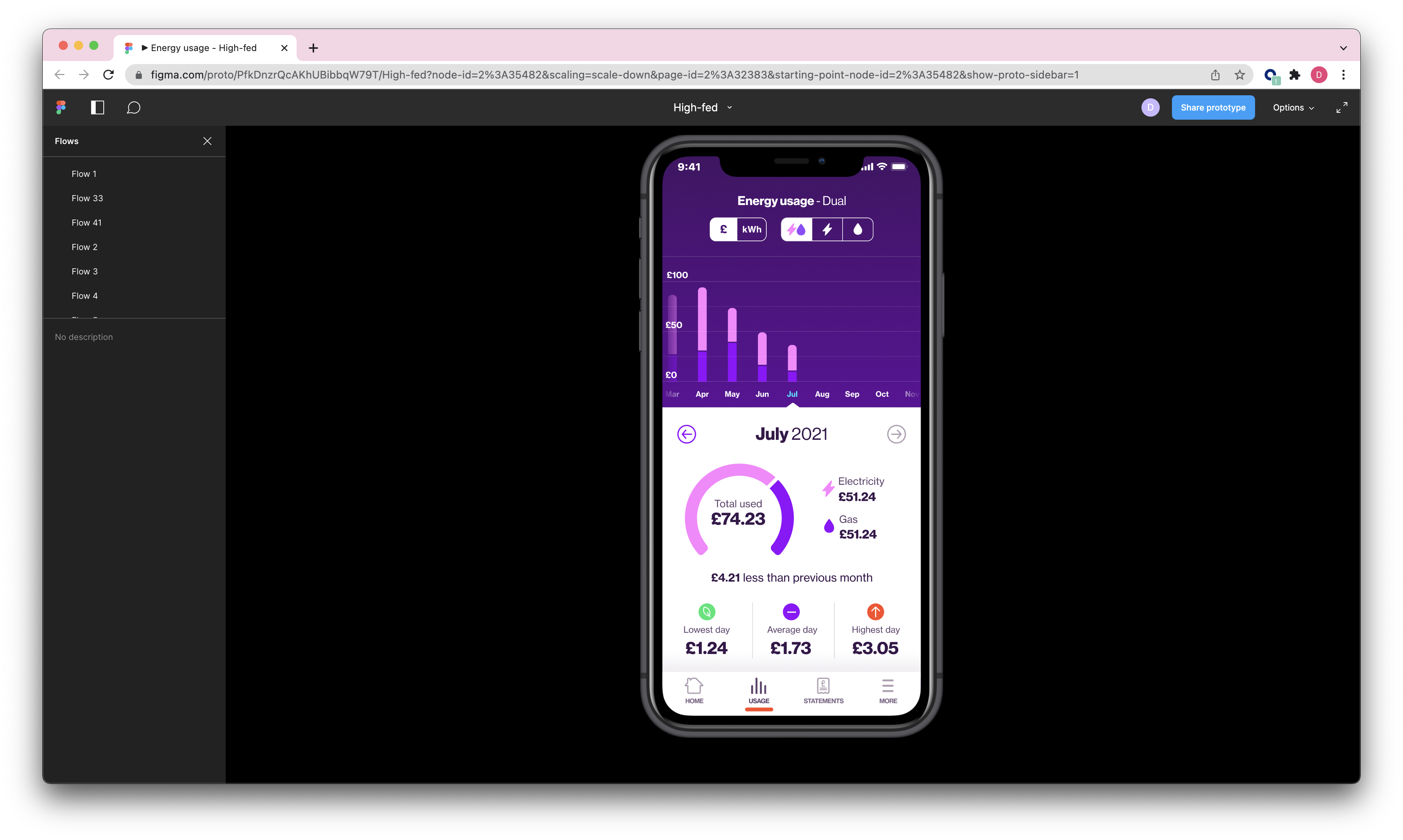
A screenshot of the prototype that was tested.
REFINE
The finishing touches
Taking the insight from the usability testing, I presented several recommendations to the client. We discussed and prioritised which changes would be best to implement in the MLP and what to put in the backlog.
I then worked closely with the developers to ensure that they had all of the screens and assets they needed. This included the mico-interactions and UI components.
Some of the high-fidelity designs used in the app.
OUTCOME
Greater visibility and control
By developing this new app, E-on next customers now have several ways to view their energy usage, giving them greater visibility and control. As a result, customers can reduce their energy usage, reducing their costs and positively impacting the environment. They can also benefit from being able to quickly access bills, submit a meter read, find help and make a payment.
Despite the challenges with the scope, tight deadlines and some key stakeholders, I'm pleased with the outcome. The app fulfils all of the key requirements, and I have engaged with the customers throughout the process. The app is now live, and I'm looking forward to seeing its impact on E-on next and their customers.
Other work
Talent BuilderSaaS
OnePlan EventsSaaS
OptumProduct design
British GasMobile app
Cera CareMobile app
University of NottinghamMobile app