OnePlan
OnePlan is a SaaS company that builds software to help people plan indoor and outdoor events. OnePlan is used by many people, ranging from the Paris Olympics to park-run organisers. I led the re-design of their flagship product, Studio, which focuses on outdoor planning.
The re-design aimed to improve the product's usability and convert users to a paid plan. Many users start using the product but leave without planning their entire event.
The outcome of the project:
- A complete re-design of their flagship product studio
- An organisation which understands, trusts and values user-centred design
- The foundation of a design system will allow faster, more consistent, and more quality design.
DISCOVERY
Benchmarking
I conducted usability testing to understand how new users interact with the software, the problems and challenges they face, and to see how effective the software is in helping users plan events. The insight allowed me to evaluate and benchmark the current experience that I could use to measure the effectiveness of the re-design.
The sessions were conducted remotely with participants from the US and UK as they are our biggest markets.
Insights
- The biggest issue with the software was that it didn't work as participants expected; it wasn't intuitive or efficient and required learning how to do the most basic tasks.
- Participants struggled the most with moving objects; it wasn't clear that they needed to unlock them before moving.
- Creating multiple instances of an object is repetitive, inefficient, and manual due to the lack of keyboard shortcuts.
- Drawing lines and areas was problematic for participants. Because of the responsiveness and low colour contrast, drawing a line wasn't clear to participants.
A screenshot from a usability testing session.
DISCOVERY
How does OnePlan compare?
I researched competitors and similar software to understand how they handle drawing, placing, and moving objects, as well as multi-select and onboarding, as these were the most problematic areas of our product. From the research, I was able to determine where our product fails to meet industry standards and identify patterns and functionality that could improve the quality and intuitiveness of our product.
Insights
- Important interactions were missing from our product, keyboard shortcuts and the ability to right-click. These interactions help to keep the UI lean and intuitive without sacrificing functionality.
- Other software is much faster and more responsive than Studio.
- The learning curve for the software I researched was far less than Studio through a mixture of templates, pre-placed items and timely prompts.
- We could remove much of our product's complexity with well-designed micro-interactions, contextual menus and searches.
Competitor analysis.
DEFINE
Establishing design principles
Before I joined OnePlan, there were no designers. Product managers or developers made the design decisions. As a result, the product lacked coherence and consistency and failed to meet basic usability standards. I worked with the team to create principles we can all follow and use to guide our design decisions. Alignment from the top down allows for faster decision-making and approval and helps improve our products' quality.
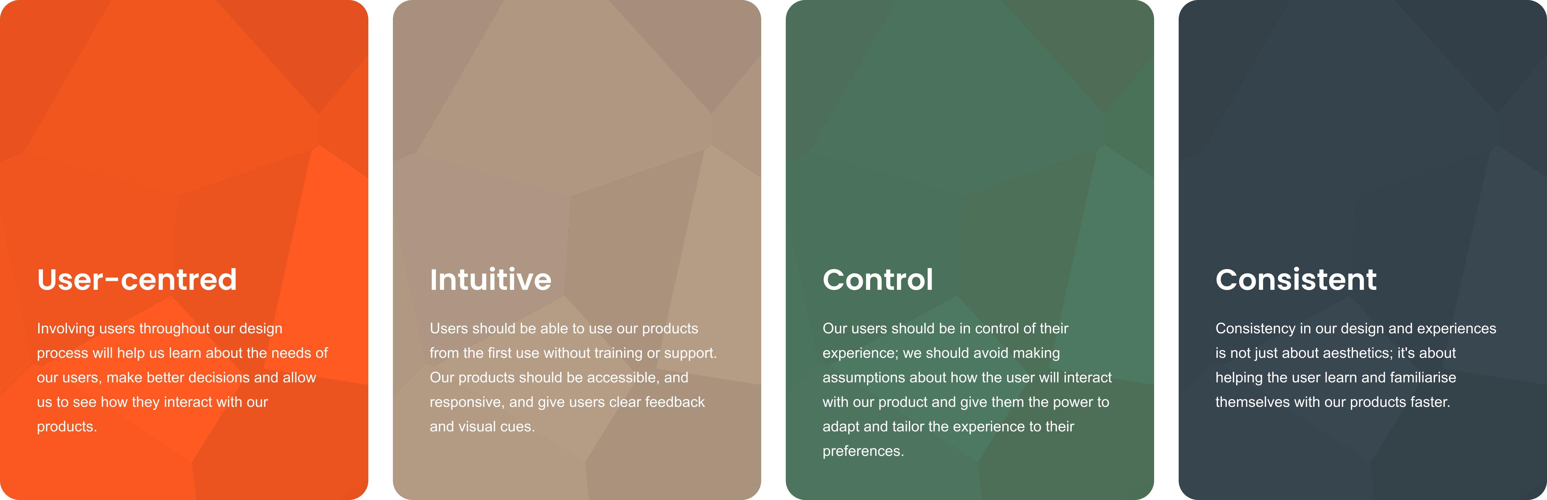
Four design principles to help guide our process and design of our products.
DEFINE
Duplication duplication
In the current experience, there are over 150 items on the menu, which are objects that users can add to the map to plan their events. It's overwhelming and time-consuming for users to pick items.
I worked with the product owner to analyse and map the existing menu items to identify opportunities to simplify and reduce the number of items in the menu to make it easier for users. I also worked with the developers to include extra capability into our database, which allows us to surface different object names depending on the country or profile of a user.
Insights
- Objects would appear in multiple categories, bloating the menu and complicating the search.
- There was a lot of unnecessary duplication within the menu; for example, one item was repeated over 50 times for each colour, border style and colour.
- The names of objects made it difficult for US-based users to find objects because the software uses UK naming conventions and doesn't tailor names to different regions.
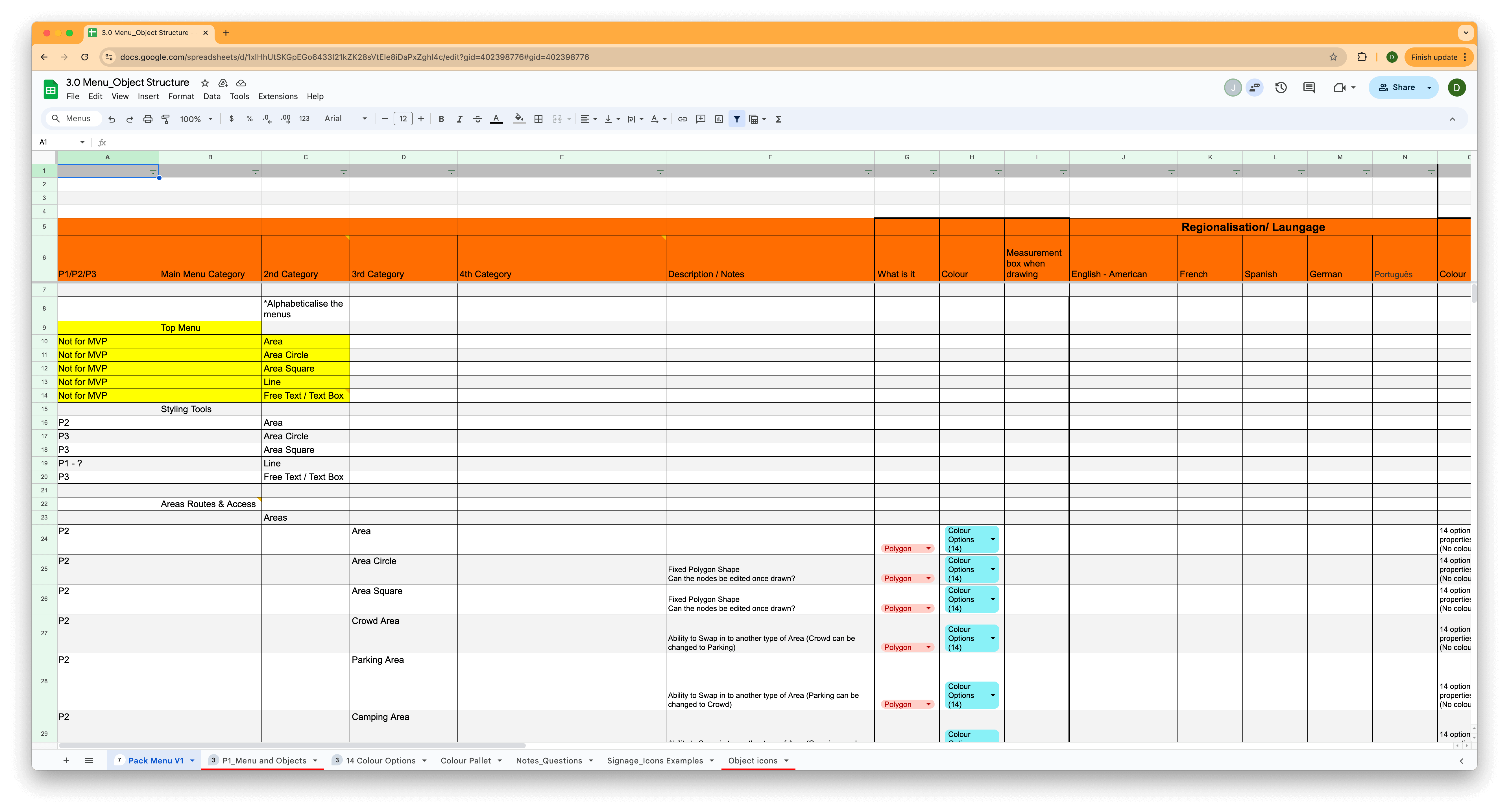
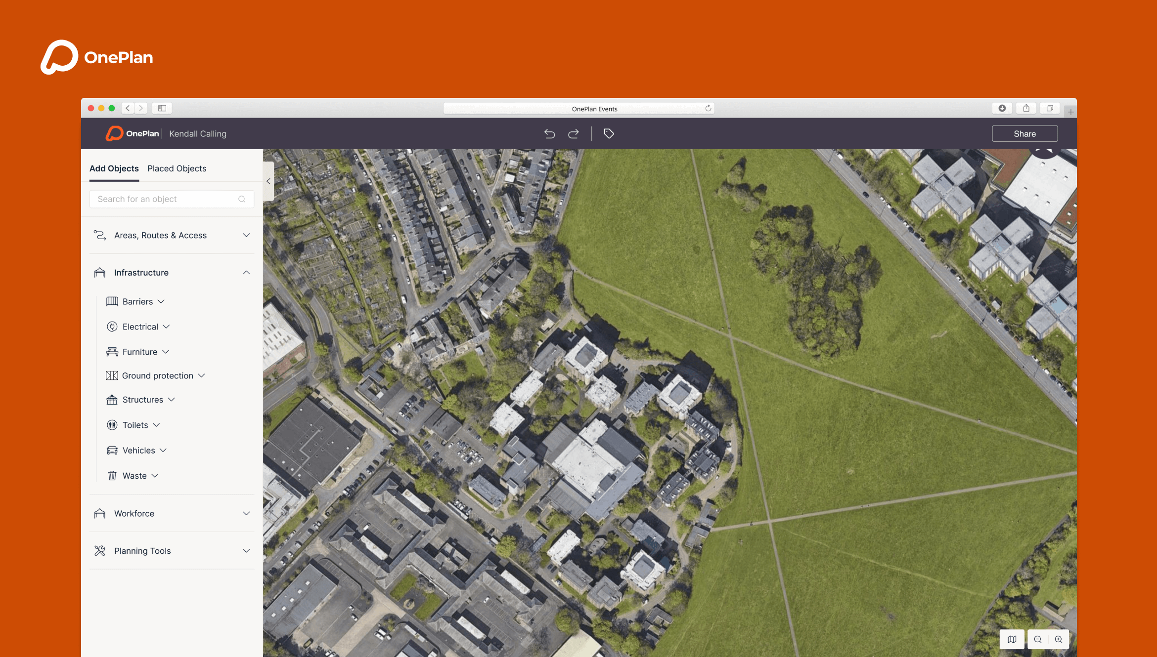
Object menu analysis.
IDEATE
How can we make it easier to find and place objects?
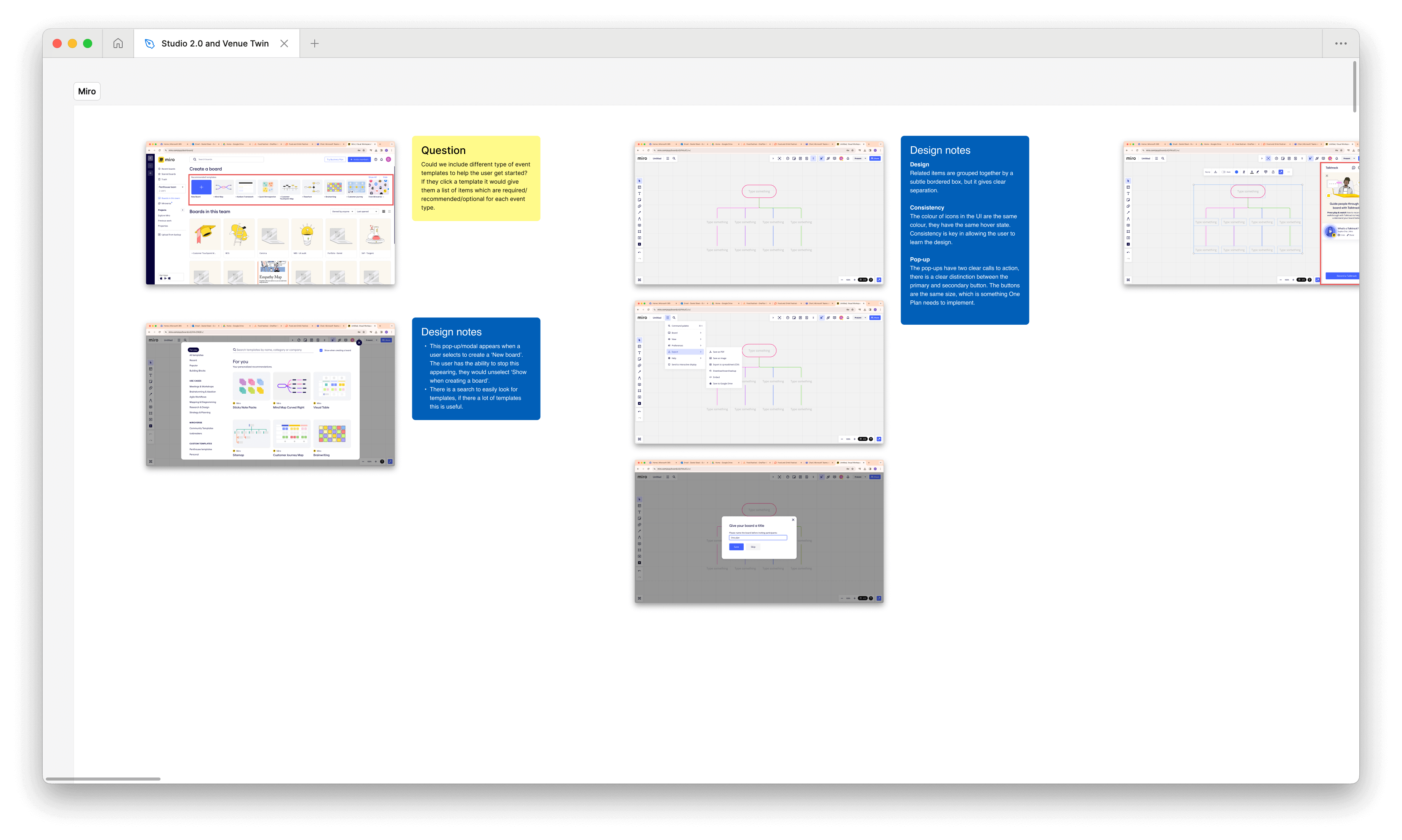
The usability testing showed that participants found finding and placing objects challenging. After re-organising and simplifying the number of objects, the next step was to explore design options. I explored many ideas, from pop-ups and floating to left and right-aligned menus.
After several rounds of prototyping and testing, I decided on a solution that separated new objects and placed objects through tabs. We included a shortcut menu and introduced a right-click menu to inform users what functionality is available and allow them to plan more efficiently. A contextual menu will appear when an object is selected; a user can control every element of an object, from size, cost and supplier.
The new menus make finding and organising objects and controlling objects easier with a lean and prioritised UI. Importantly, this design is scalable, ensuring it can adapt to future needs and growth.
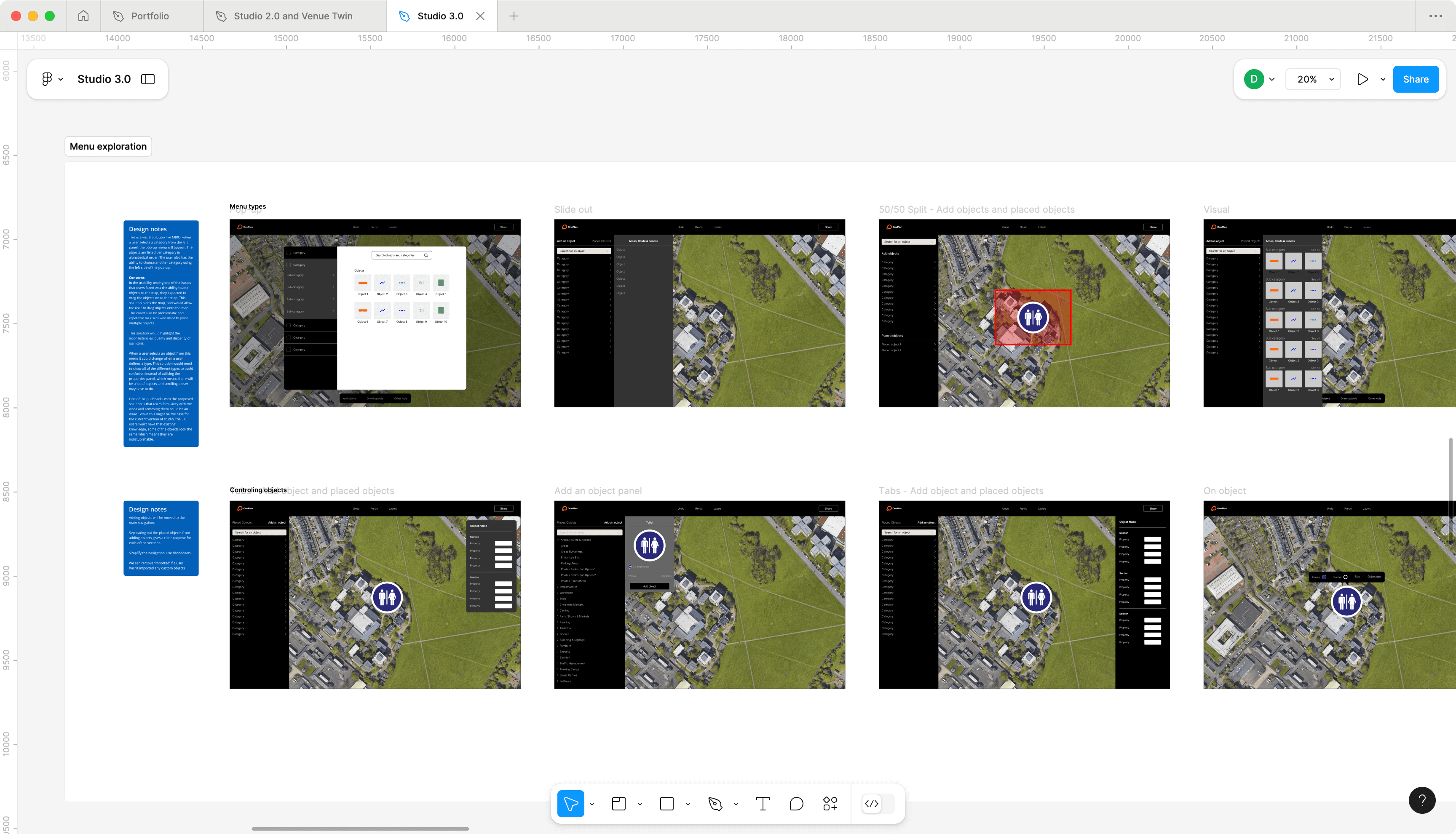
Design exploration for the menus.
DESIGN AND PROTOTYPING
MVP and beyond
I designed the entire user interface from the ground up, covering everything from fonts to hover states. The focus of the design was usability and accessibility; the style is minimal, has a clear hierarchy and has been prioritised around the user's needs. Fonts are large to aid usability and readability.
OnePlan did have an existing brand. However, that was created for marketing materials, not software or digital products. I worked with the brand team to introduce new colours, styles, and guidelines to ensure the brand was flexible, coherent, and fit for this project and future developments.
I left the team at OnePlan with the complete designs for MVP and a foundational design system to help them build faster and consistently. The designs are flexible and use components, tokens and variables to help future roll out across their other products.
Placing an object - high-fidelity prototype.
"From the start, Daniel demonstrated impressive skill and a deep understanding of user experience principles, significantly enhancing our product’s usability and aesthetics. His commitment to understanding our user base ensured that every change was purposeful and user-centric, resulting in a design that is both visually appealing and intuitive."
NIM WICHIENKUER - VP PRODUCT
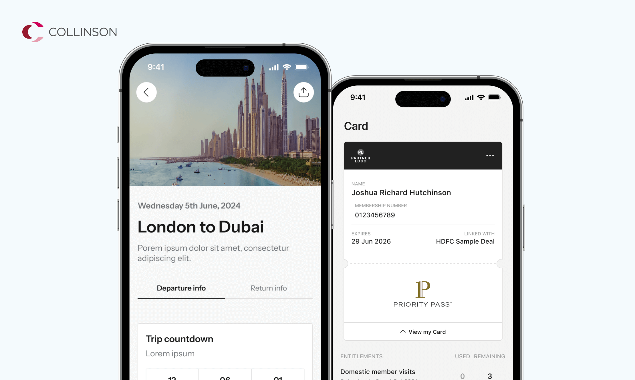
Other work
E-on NextMobile app
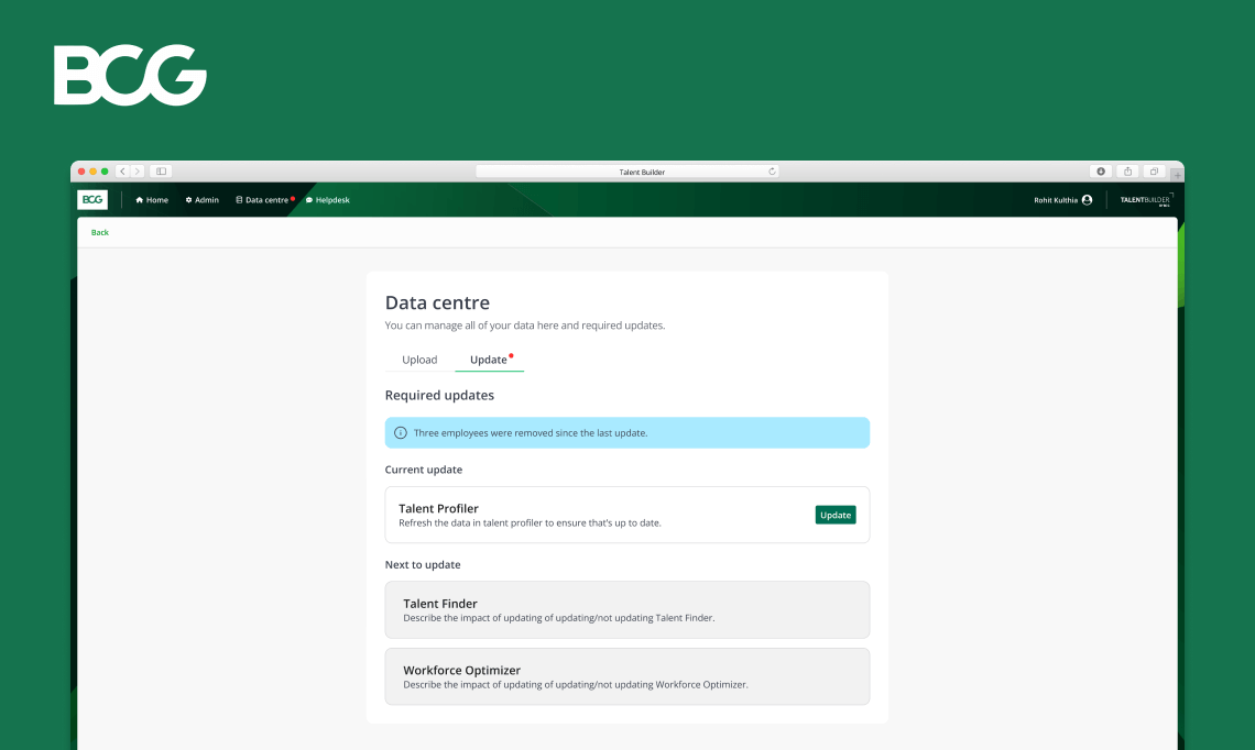
Talent BuilderSaaS
OptumProduct design
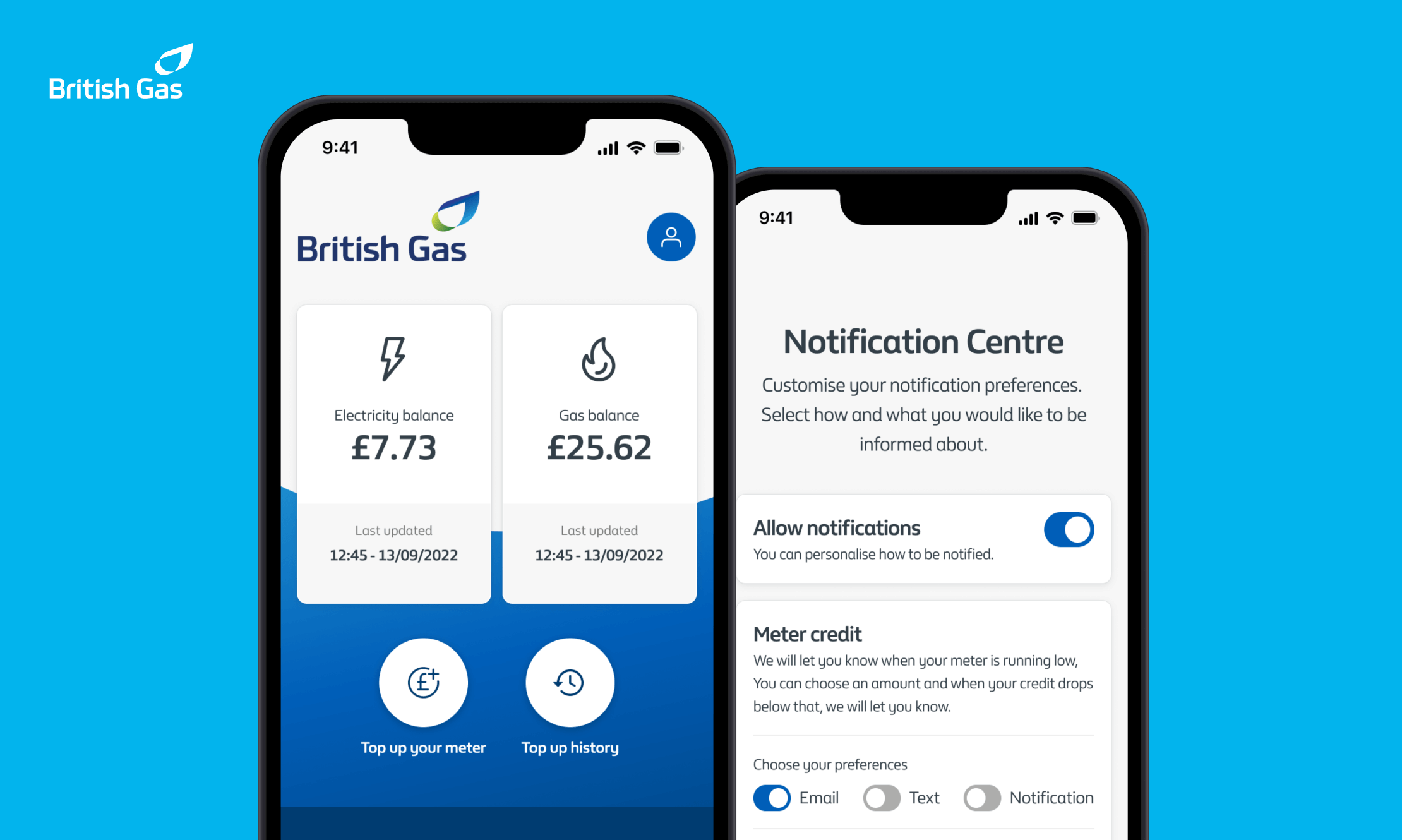
British GasMobile app
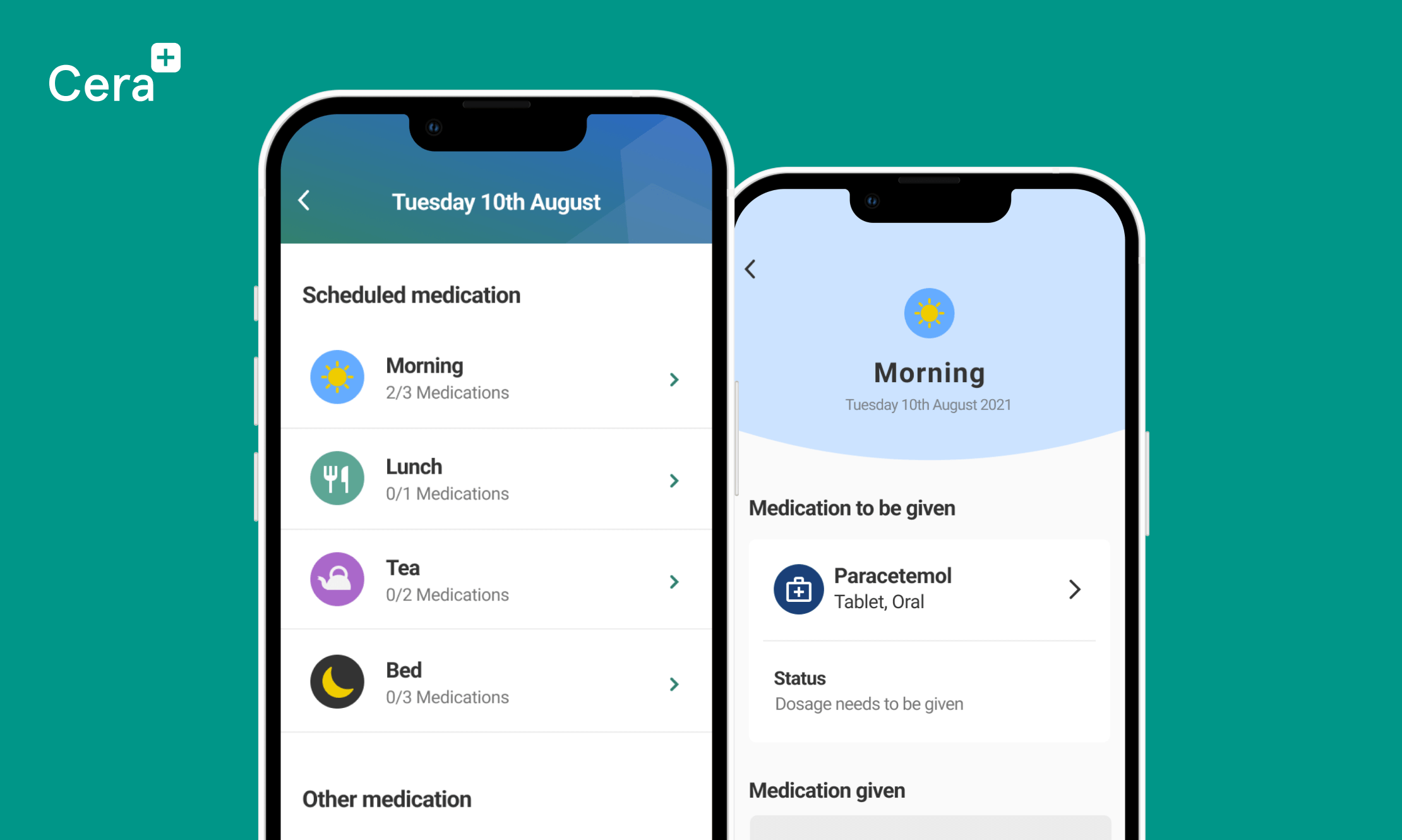
Cera CareMobile app
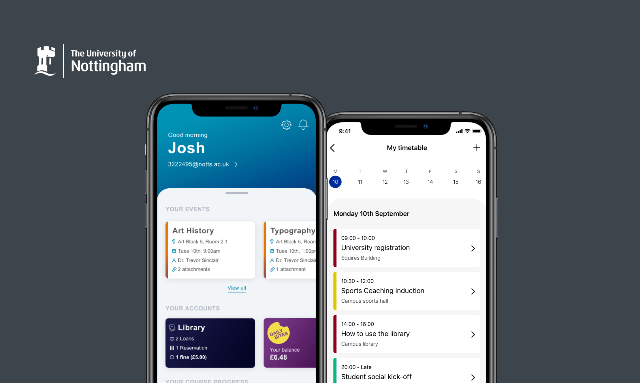
University of NottinghamMobile app