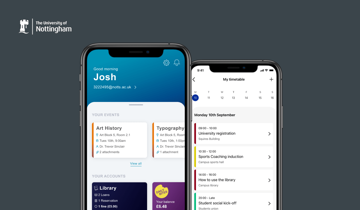
University of Nottingham
At the University of Nottingham, there are 36,000 students spread across the four UK campuses. The mobile app plays a vital role in the student's experience providing academic timetables, campus travel information and campus maps to help students get around.
I worked within an agile development team which included a product owner, developers, testers and myself as the UX lead. The purpose of the app was to improve the entire student experience from applicant to graduate.
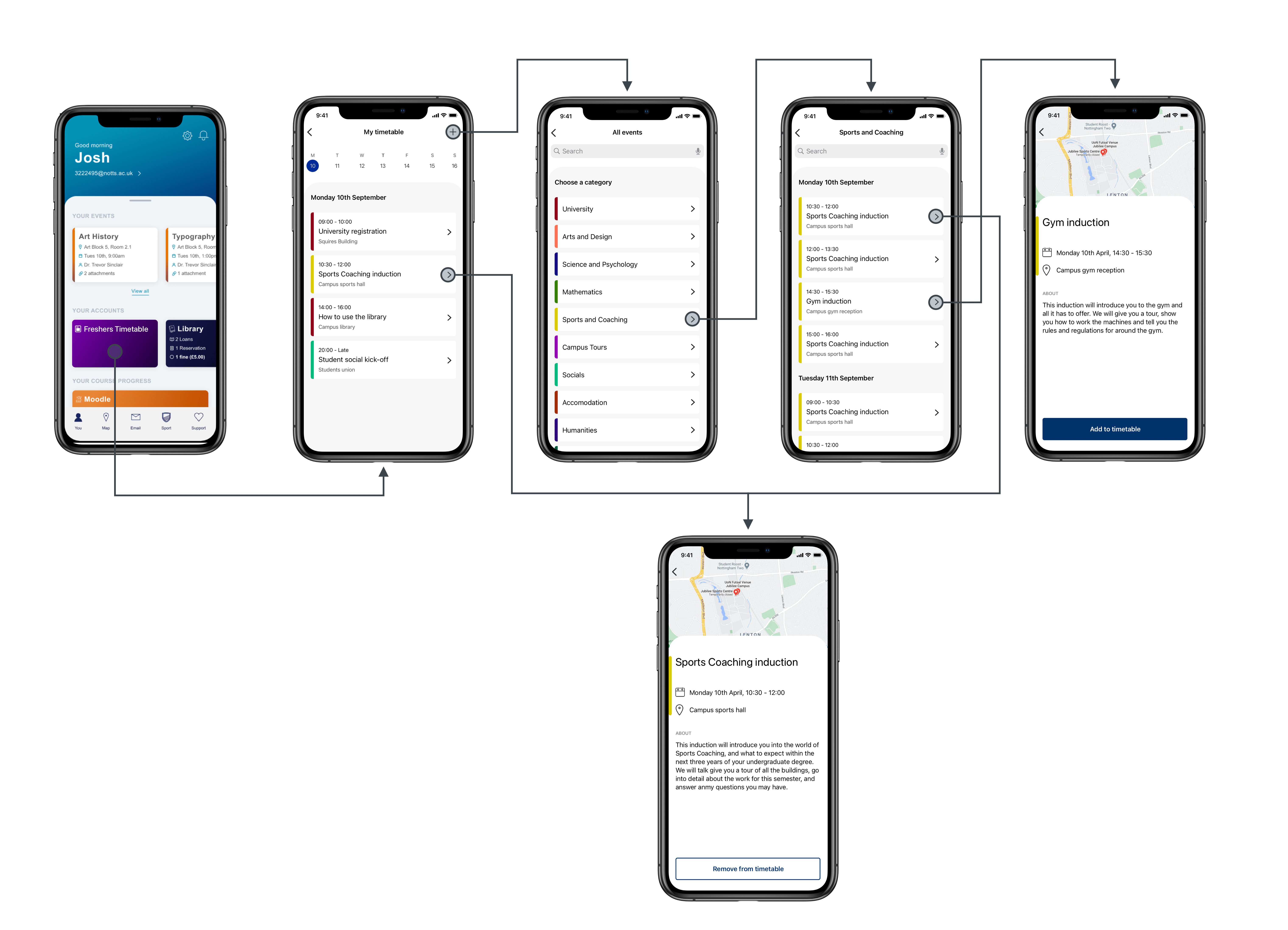
One of the key projects I worked on was a feature that supports and guides first-year students through their first weeks at the university. The start of university can be daunting for many students. They could be living alone in a new city or country. Students have to navigate around three campuses, attend course-related inductions, move into their accommodation, collect their student cards, and so much more.
DISCOVERY
How can we support our students through freshers?
I planned and facilitated a mini design sprint over two days to explore the possibilities of building a new mobile app feature to support students during their first weeks at the university. The product team, representatives from the business and current students, were in attendance.
We worked through various activities during the sprint to define the problem and what success would look like. We generated concepts and voted on our favourite that we would like to develop as a prototype.
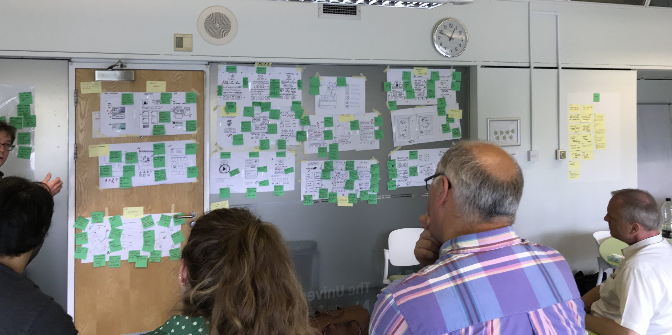
Participants present their concepts to the group during a design sprint.
IDEATE
Sketching end to end journeys
The outcome of the design sprint was a concept that I could develop and test with students. I used the concept as a foundation to expand upon, building out more of the screens, unhappy paths and alternative flows. I started by sketching some low-fidelity ideas.
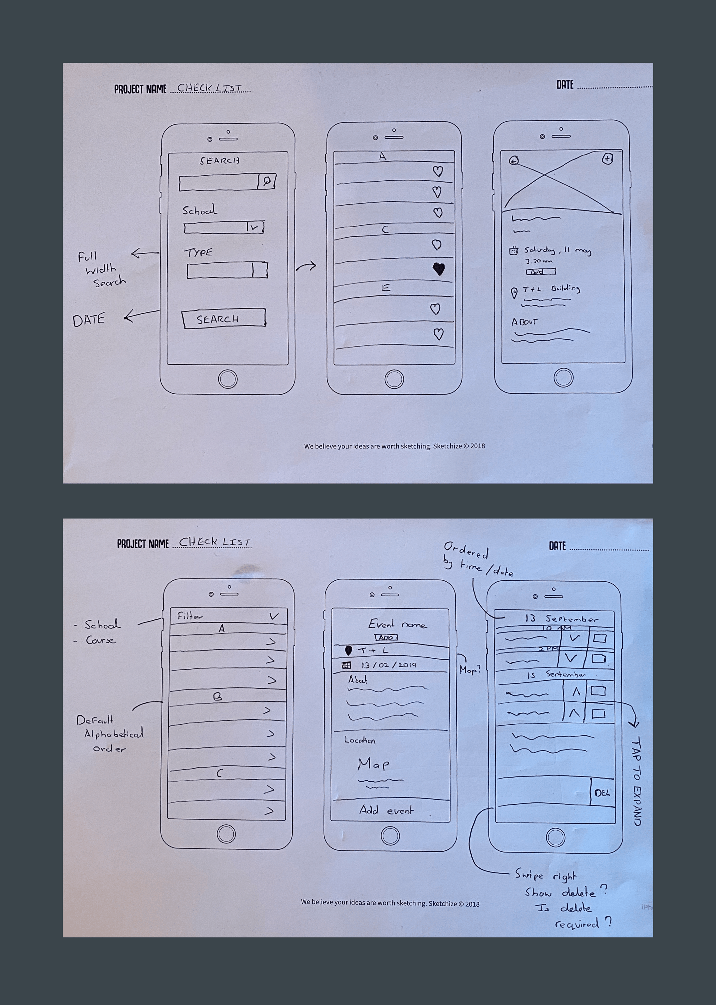
Low-fidelity sketches.
PROTOTYPING AND TESTING
Will this be useful for students?
Using the sketches, I worked with a developer to build out a prototype. The prototype was low-fidelity and built using the actual codebase. At this stage, I wanted to test the flow and use actual event/activities. The prototype took two days to create and has the same interactions, such as a search and navigation.
Time was scarce on this project. I had to conduct the usability testing quickly before the feature needed to go into development. I set up in the library, which is always busy with students and asked them to test the app. The usability sessions were moderated and recorded using Lookback.
Key findings
- The main frustration participants had was the speed of the app.
- The app was slow to load, and the responsiveness of the interactions led to several usability issues.
- Some of the event titles were exceptionally large and broke the design.
REFINE AND DEVELOPMENT
Performance and discoverability
The usability testing highlighted some interactions that weren't obvious and where feedback was slow. So I spent time improving the UI whilst the developer worked on the performance.
Some of the high-fidelity designs I created to guide the developer.
OUTCOME
Supporting our students at a critical time
The delivery of the 'freshers' feature helped thousands of students to seamlessly transition into university life. Students could see a personalised timetable to help them structure their day and find extra-curricular activities. The creation of the feature meant students could easily access the information they required and find support if they needed it.
Other work
E-on NextMobile app
Talent BuilderSaaS
OnePlan EventsSaaS
OptumProduct design
British GasMobile app
Cera CareMobile app